Deploy Your Time Series Forecasting Model With Streamlit
Apr 24, 2023
As data scientists, we often work in the experimentation phase. We work in notebooks and develop scripts to evaluate models, and it stops there.
However, our work is never really done until the model is deployed. This crucial step brings us new challenges, as we have to think about error handling, and building an interface to interact with the model.
This is where Streamlit comes in, which is a Python library that allows us to build data applications in a simple and intuitive way. The best part is that we only need to use Python for both the modelling portion and building the user interface.
Note that Streamlit is a great way to quickly deploy models, but it will probably not power high-traffic, full-fledged data applications. Nevertheless, it remains a great option to add interactivity and also share our data science work with others.
In this article, we will go through the portion of deploying a time series model using Streamlit. The full project is a multi-page application where we can both explore and forecast the data, but for this article, we focus only on the forecasting functionality.
You can visit the finished application and play around with it. Also, the full source code is available on GitHub.
Learn the latest time series analysis techniques with my free time series cheat sheet in Python! Get the implementation of statistical and deep learning techniques, all in Python and TensorFlow!
Let’s get started!
Objective
The objective of this application is to forecast the quarterly population in Canada. The dataset is taken from Statistics Canada, and spans Q3 of 1991 to Q1 of 2023. The original data can be found here.
Below is a sample of the dataset.
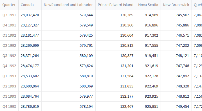
With this dataset, we have information on the population of the entire country, but also for each province and territory. This means that we can choose between multiple targets, which we must keep in mind when building the application.
Project structure
Since we are building an application that will deployed into production, the structure of the project matters greatly. Below is the structure that we use for this project.
streamlit-population-canada
├── data
│   └── quarterly_canada_population.csv
├── pages
│   └── forecast.py
├── main.py
├── README.md
└── requirements.txt
In our project folder, we have a data folder that contains the CSV file with the quarterly population estimates. Note that we will read the data from the GitHub URL, to avoid dealing with relative and absolute file paths.
Then, because we are building a multi-page application, we have a pages folder that will contain the script to build the interface and output the forecast, which is forecast.py.
The main entry point to the application is controlled by the file main.py, but we will not cover it as it is not related to forecasting.
Finally, the file requirements.txt lists all the dependencies of the application to work properly.
Application diagram
Before we dive into the code, we must first determine how the application will work at a high-level to understand where each functionality comes into play.
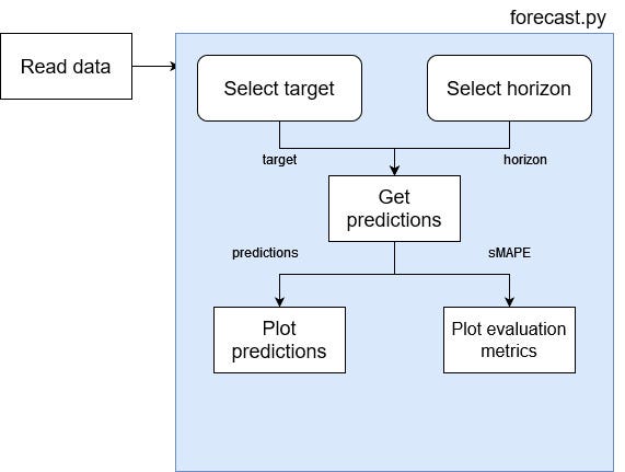
From the figure above, we see that the data has to be read and made available in the script.
Then, we add an option for the user to select a target and a horizon. We send that information to a function that will test different models and generate predictions using the best model only.
Then, the predictions are returned so that we can plot the forecast. Also, we return the evaluation metric, so that we can visualize it and identify what model was used.
With the right project structure and an overall idea of what to build, we can now dive into the code and start building out our application.
Read the data
The first natural step is of course to read the data. Now, because this is part of a multi-page application we actually read the data in main.py and make it available in pages/forecast.py.
We start off by defining a function that will read the data. Notice how we read from a URL, which avoids having problems with file paths when deploying our application. For now, this is all standard code of how we would read a data in a notebook.
import streamlit as st
import pandas as pd
import numpy as np

@st.cache_data
def read_data():
    URL = "https://raw.githubusercontent.com/marcopeix/streamlit-population-canada/master/data/quarterly_canada_population.csv"
    df = pd.read_csv(URL, index_col=0, dtype={'Quarter': str,
                                          'Canada': np.int32,
                                          'Newfoundland and Labrador': np.int32,
                                          'Prince Edward Island': np.int32,
                                          'Nova Scotia': np.int32,
                                          'New Brunswick': np.int32,
                                          'Quebec': np.int32,
                                          'Ontario': np.int32,
                                          'Manitoba': np.int32,
                                          'Saskatchewan': np.int32,
                                          'Alberta': np.int32,
                                          'British Columbia': np.int32,
                                          'Yukon': np.int32,
                                          'Northwest Territories': np.int32,
                                          'Nunavut': np.int32})

    return df
Notice also the use of the decorator @st.cache_data. This tells Streamlit to cache the result of this function if the parameters do not change. That way, we do not have to rerun the function every time the user changes an input. This makes the application run much faster.
Then, we store the data in the session state. This is a way to store and persist data across multiple pages in Streamlit. That way, we can read the data in main.py and have access to it in pages/forecast.py.
df = read_data()

if df not in st.session_state:
    st.session_state['df'] = df
It essentially works as a dictionary in which we can store important values that we want to access from different pages.
That way, in pages/forecast.pywe can then access the data with
df = st.session_state['df']
Even though we are in another file, we do not have to repeat the function to read the data, we can simply access it through the session state.
Build the interface
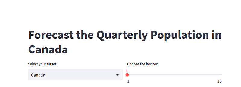
Now that we have access to our data, let’s build out the interface to allow the user to select a target and a forecast horizon.
First, let’s allow the user to select a target. In our dataset, the target corresponds to a location, whether it is the entire country, a province or a territory. If you recall the dataset sample shown above, the list of possible targets is simply the name of the columns in the dataset.
So, let’s create 2 columns, so the user can select the target and the horizon on the same line.
import streamlit as st

st.title('Forecast the Quarterly Population in Canada')

col1, col2 = st.columns(2)
Then, in the first column, we will create a dropdown list that has all the possible targets in the dataset.
target = col1.selectbox('Select your target', df.columns)
In the code block above, the first parameter is a label for the input, and then we pass the list of possible values. By default, the first value of the list will be selected.
Then, to set the forecast horizon, let’s use a slider. Here, I will restrict the horizon from 1 to 16 quarters into the future, but feel free to play around with those numbers.
horizon = col2.slider('Choose the horizon', min_value=1, max_value=16, value=1, step=1)
As you can see, the code above is pretty self-explanatory: we pass in a label for the input element, specify the minimum value, the maximum value, the default value, and of course the increment step.
At this point, the interface looks like this:
Great!
Now, let’s add a button so that we only run the function to return the predictions once the user has set both the target and the horizon. Otherwise, Streamlit runs the entire script as soon as a change is registered.
forecast_btn = st.button('Forecast')
And we get this:
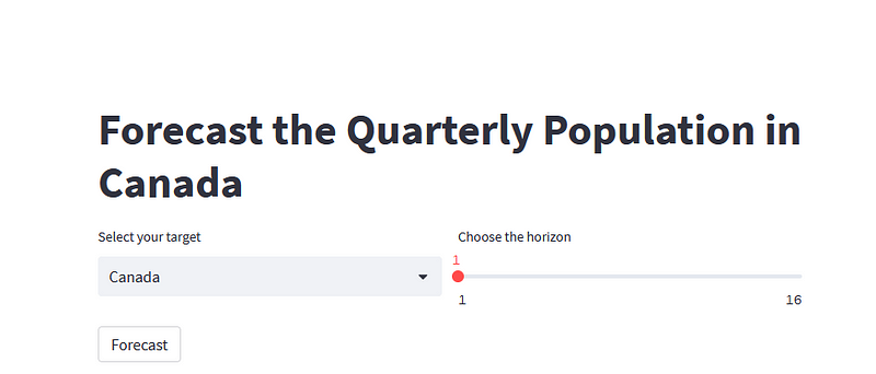
Alright, the interface is in place, now let’s code the logic to select the best model and generate predictions.
Generate predictions
Once the user has set the target and horizon, we want to test different models so that we get the best forecasts possible according to the target and horizon.
Then, it would be useful to plot the predictions and also display the evaluation metrics that justify the choice of the model. This is what we implement in this section.
Procedure for model selection
For this application, we will test three different models:
Detailing each model would be too long, so I have linked to other articles if you would like to explore each one of them in detail.
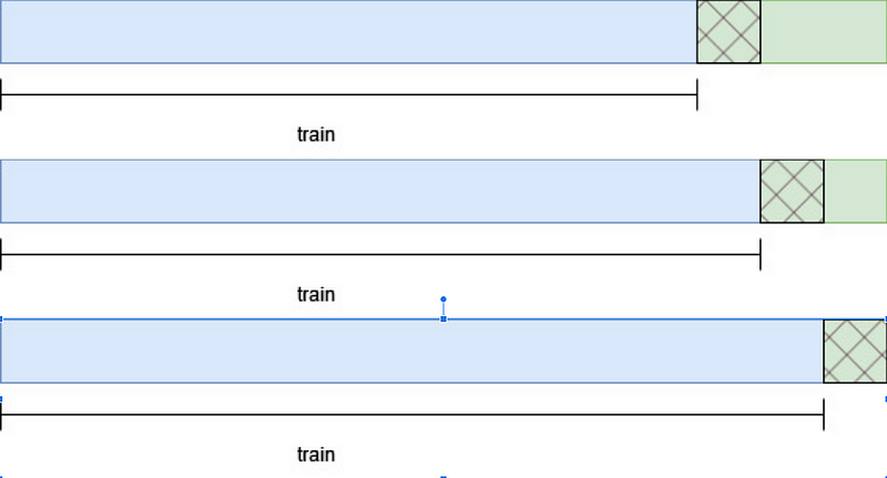
Now, for each model, we will train it on a training set and evaluate it on a test set. The test set will contain the last 32 timesteps of the data, and the rest will be for training.
Also, we will make rolling predictions, such as to simulate the process of updating the model with new data and making new predictions. This means that if the horizon is set to 2 timesteps, then the model will forecast 2 future timesteps at a time, until it has predicted the entire test set, as shown below.
All of this logic is translated into the code block below.
@st.cache_data
def rolling_predictions(df, train_len, horizon, window, method):

    TOTAL_LEN = len(df)

    if method == 'ar':
        best_lags = ar_select_order(df[:train_len], maxlag=8, glob=True).ar_lags
        pred_AR = []

        for i in range(train_len, TOTAL_LEN, window):
            ar_model = AutoReg(df[:i], lags=best_lags)
            res = ar_model.fit()
            predictions = res.predict(i, i + window -1)
            oos_pred = predictions[-window:]
            pred_AR.extend(oos_pred)

        return pred_AR[:horizon]

    elif method == 'holt':
        pred_holt = []

        for i in range(train_len, TOTAL_LEN, window):
            des = Holt(df[:i], initialization_method='estimated').fit()
            predictions = des.forecast(window)
            pred_holt.extend(predictions)

        return pred_holt[:horizon]

    elif method == 'theta':
        pred_theta = []

        for i in range(train_len, TOTAL_LEN, window):
            tm = ThetaModel(endog=df[:i], deseasonalize=False)
            res = tm.fit()
            preds = res.forecast(window)
            pred_theta.extend(preds)

        return pred_theta[:horizon]
In the code block above, we simply take each model, train it on the initial training set, and complete the loop by updating the training set and making predictions until we have predictions for the entire test set.
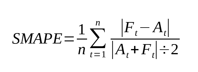
Evaluation metric
To select the best model, we use the symmetric mean absolute percentage error or sMAPE. The reason for that is that the MAPE tends to favor models that under-forecast. The sMAPE fixes that problem and is defined as:
So, let’s define a function to calculate the sMAPE:
def smape(actual, predicted):

    if not all([isinstance(actual, np.ndarray), isinstance(predicted, np.ndarray)]):
        actual, predicted = np.array(actual), np.array(predicted)

    return round(np.mean(np.abs(predicted - actual) / ((np.abs(predicted) + np.abs(actual))/2))*100, 2)
Select the best model
Let’s get started on the function that will run the model selection procedure. It takes in the dataset, the target and horizon, and we start off by defining the training and test sets.
@st.cache_data
def test_and_predict(df, col_name, horizon):
    df = df.reset_index()
    model_list = ['ar', 'holt', 'theta']
    train = df[col_name][:-32]
    test = df[['Quarter', col_name]][-32:]
    total_len = len(df)

    train_len = len(train)
    test_len = len(test)
Then, we use our rolling_predictions function to generate the predictions over the test set.
pred_AR = rolling_predictions(df[col_name], train_len, test_len, horizon, 'ar')
pred_holt = rolling_predictions(df[col_name], train_len, test_len, horizon, 'holt')
pred_theta = rolling_predictions(df[col_name], train_len, test_len, horizon, 'theta')

test['pred_AR'] = pred_AR
test['pred_holt'] = pred_holt
test['pred_theta'] = pred_theta
Now that we have all the predictions for the entire test set, we can evaluate each model using the sMAPE.
smapes = []

smapes.append(smape(test[col_name], test['pred_AR']))
smapes.append(smape(test[col_name], test['pred_holt']))
smapes.append(smape(test[col_name], test['pred_theta']))
Then, the best model is simply the one that achieves the lowest sMAPE.
best_model = model_list[np.argmin(smapes)]
Then, we can simply use the best model to get the predictions.
Make predictions
Depending on which model achieved the lowest sMAPE, we will train it on the entire dataset to generate out-of-sample predictions and actually predict the future.
This can be done with simple if statements.
if best_model == 'ar':
    best_lags = ar_select_order(train, maxlag=8, glob=True).ar_lags
    ar_model = AutoReg(df[col_name], lags=best_lags)
    res = ar_model.fit()
    predictions = res.predict(total_len, total_len + horizon - 1)

    return predictions, smapes

elif best_model == 'holt':
    des = Holt(df[col_name], initialization_method='estimated').fit()
    predictions = des.forecast(horizon)

    return predictions, smapes

elif best_model == 'theta':
    tm = ThetaModel(endog=df[col_name], deseasonalize=False)
    res = tm.fit()
    predictions = res.forecast(horizon)
Then, our test_and_predict function will return the predictions and the sMAPE for each model. That way, we can visualize both the predictions and the evaluation metric for each model.
The full function is shown below.
@st.cache_data
def test_and_predict(df, col_name, horizon):
    df = df.reset_index()
    model_list = ['ar', 'holt', 'theta']
    train = df[col_name][:-32]
    test = df[['Quarter', col_name]][-32:]
    total_len = len(df)

    train_len = len(train)
    test_len = len(test)

    pred_AR = rolling_predictions(df[col_name], train_len, test_len, horizon, 'ar')
    pred_holt = rolling_predictions(df[col_name], train_len, test_len, horizon, 'holt')
    pred_theta = rolling_predictions(df[col_name], train_len, test_len, horizon, 'theta')

    test['pred_AR'] = pred_AR
    test['pred_holt'] = pred_holt
    test['pred_theta'] = pred_theta

    smapes = []

    smapes.append(smape(test[col_name], test['pred_AR']))
    smapes.append(smape(test[col_name], test['pred_holt']))
    smapes.append(smape(test[col_name], test['pred_theta']))

    best_model = model_list[np.argmin(smapes)]

    if best_model == 'ar':
        best_lags = ar_select_order(train, maxlag=8, glob=True).ar_lags
        ar_model = AutoReg(df[col_name], lags=best_lags)
        res = ar_model.fit()
        predictions = res.predict(total_len, total_len + horizon - 1)

        return predictions, smapes

    elif best_model == 'holt':
        des = Holt(df[col_name], initialization_method='estimated').fit()
        predictions = des.forecast(horizon)

        return predictions, smapes

    elif best_model == 'theta':
        tm = ThetaModel(endog=df[col_name], deseasonalize=False)
        res = tm.fit()
        predictions = res.forecast(horizon)

        return predictions, smapes
Get predictions when the button is clicked
We have the interface and we have all the logic to test and generate predictions. Now, we only have to connect them.
We can detect if the button was clicked with an if statement, as Streamlit return True when the button is clicked.
if forecast_btn:
    preds, smapes = test_and_predict(df, target, horizon)
Note that in the code block above,target, and horizon are variables defined earlier in this article that capture the information set by the user using a dropdown menu and a slider respectively.
Then, inside the if statement, we generate two plots: one for the forecast and the other for the evaluation metric.
Plotting in Streamlit is just like using matplotlib in a Jupyter notebook. We simply render the plot using the pyplot method.
tab1, tab2 = st.tabs(['Predictions', 'Model evaluation'])
pred_fig, pred_ax = plt.subplots()
pred_ax.plot(df[target])
pred_ax.plot(preds, label='Forecast')
pred_ax.set_xlabel('Time')
pred_ax.set_ylabel('Population')
pred_ax.legend(loc=2)
pred_ax.set_xticks(np.arange(2, len(df) + len(preds), 8))
pred_ax.set_xticklabels(np.arange(1992, 2024 + floor(len(preds)/4), 2))
pred_fig.autofmt_xdate()
tab1.pyplot(pred_fig)
The result of the code block above is this:
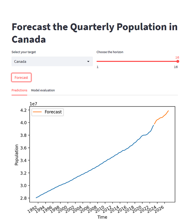
As you can see, the user selected Canada as the target and a horizon of 16 quarters. After clicking the button, the plot is rendered.
Then, let’s plot a bar plot to see which model performed best during the testing procedure.
eval_fig, eval_ax = plt.subplots()

x = ['AR', 'DES', 'Theta']
y = smapes

eval_ax.bar(x, y, width=0.4)
eval_ax.set_xlabel('Models')
eval_ax.set_ylabel('sMAPE')
eval_ax.set_ylim(0, max(smapes)+0.1)

for index, value in enumerate(y):
    plt.text(x=index, y=value + 0.015, s=str(round(value,2)), ha='center')

tab2.pyplot(eval_fig)
This gives the following result:
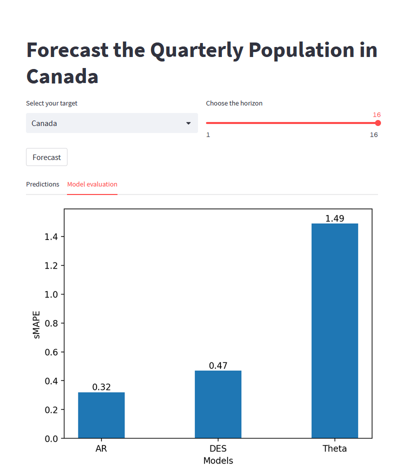
From the figure above, we see that the AR model is the best model, as it achieved the lowest sMAPE, specifically for predicting the quarterly population of Canada over the next 16 quarters. Therefore, the AR model was used to make the out-of-sample predictions that we see in the line plot above.
Awesome, everything works great on our local machine, so let’s actually deploy this and share it with the world!
Deploy to production
The easiest (and free) way of deploying a Streamlit application is by using the Streamlit Community Cloud.
To deploy an application, you need:
- A GitHub account to host the source code of your application
- A Streamlit Community Cloud account (free)
- A
requirements.txtfile to list the dependencies
List the dependencies
The hardest of deploying a Streamlit application is actually listing the dependencies, especially if your work on a Windows machine with Anaconda (like I do).
If you are on Linux, then it is as simple as pip freeze > requirements.txt.
At the time of writing, the documentation of Streamlit states that they support the environment.yml file that you can generate with Anaconda, but I found that it breaks the deployment process. So, you need to resort to the .txt file.
With Anaconda, run conda list -e > requirements.txt. However, your file will not be formatted correctly and it will have a lot of mistakes, that you need to fix by hand.
A simple way of fixing it is to get rid of everything but the packages that you actually import at the beginning of the your script. In our case, that would be:
- pandas
- numpy
- matplotlib
- statsmodels
Everything else in your file can be deleted.
Also, it is very important to delete streamlit from your dependencies, as this will break the deployment process. You can see what your file should look like here.
Launch to production
Once you have the dependencies listed, make sure that all the code is in a GitHub repository.
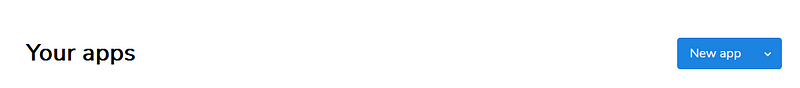
Then, in your Streamlit Community Cloud account, click “New app”.
Then, simply specify the URL for the repository, the branch (should be master) and the main file path. Usually, you have a main Python script at the root of your project.
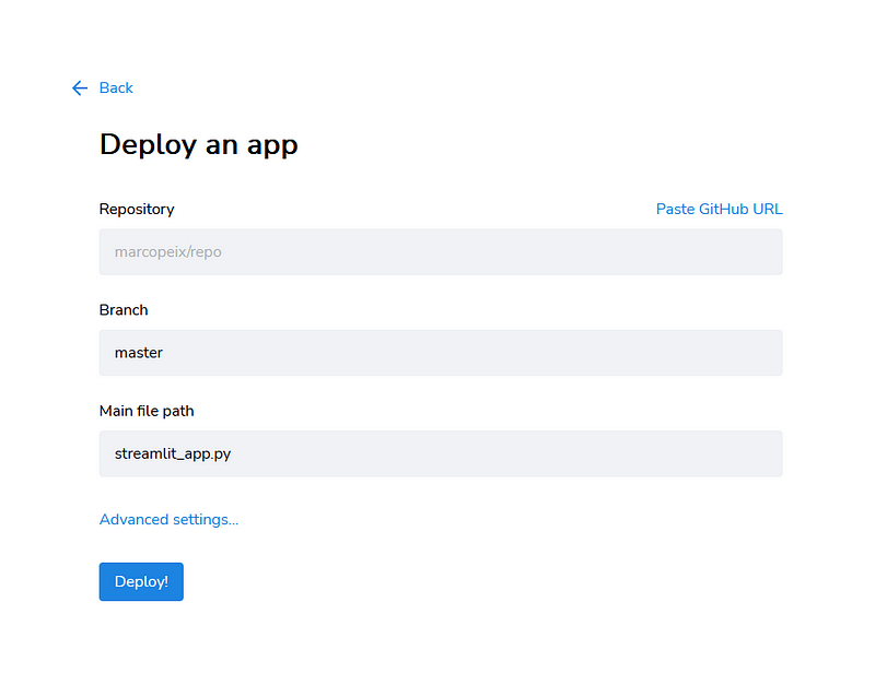
Then, simply click “Deploy” and that’s it! You will then have a link that you can use to share your application with everyone!
Again, if you want to see the full final result, you check the application here!
Conclusion
Deploying a model using Streamlit is intuitive and straightforward. Using only Python, we managed to create an interactive web interface that can cache data, read user input, run a model and generate predictions for the future!
I hope that this article inspires you to dig further into Streamlit and make a little application of your own!
Cheers 🍻
Support me
Enjoying my work? Show your support with Buy me a coffee, a simple way for you to encourage me, and I get to enjoy a cup of coffee! If you feel like it, just click the button below 👇

Stay connected with news and updates!
Join the mailing list to receive the latest articles, course announcements, and VIP invitations!
Don't worry, your information will not be shared.
I don't have the time to spam you and I'll never sell your information to anyone.
