Time Series Forecasting with SARIMA in Python
Aug 25, 2022
In previous articles, we introduced moving average processes MA(q), and autoregressive processes AR(p). We combined them and formed ARMA(p,q) and ARIMA(p,d,q) models to model more complex time series.
Now, add one last component to the model: seasonality.
This article will cover:
- Seasonal ARIMA models
- A complete modelling and forecasting project with real-life data
The notebook and dataset are available on Github.
Let’s get started!
For a complete reference on time series analysis in Python, covering both statistical and deep learning models, check my free time series cheat sheet!
SARIMA Model
Up until now, we have not considered the effect of seasonality in time series. However, this behaviour is surely present in many cases, such as gift shop sales, or total number of air passengers.
A seasonal ARIMA model or SARIMA is written as follows:
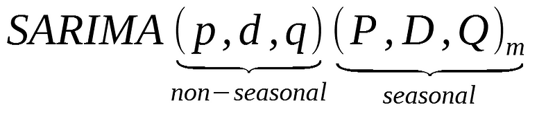
You can see that we add P, D, and Q for the seasonal portion of the time series. They are the same terms as the non-seasonal components, by they involve backshifts of the seasonal period.
In the formula above, m is the number of observations per year or the period. If we are analyzing quarterly data, m would equal 4.
ACF and PACF plots
The seasonal part of an AR and MA model can be inferred from the PACF and ACF plots.
In the case of a SARIMA model with only a seasonal moving average process of order 1 and period of 12, denoted as:
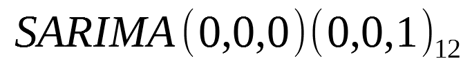
- A spike is observed at lag 12
- Exponential decay in the seasonal lags of the PACF (lag 12, 24, 36, …)
Similarly, for a model with only a seasonal autoregressive process of order 1 and period of 12:
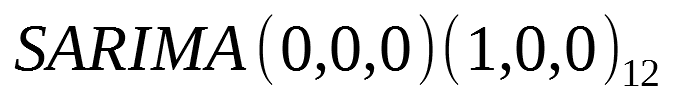
- Exponential decay in the seasonal lags of the ACF (lag 12, 24, 36, …)
- A spike is observed at lag 12 in the PACF
Modelling
The modelling process is the same as with non-seasonal ARIMA models. In this case, we simply need to consider the additional parameters.
Steps required to make the time series stationary and selecting the model according to the lowest AIC remain in the modelling process.
Let’s cover a complete example with a real-world dataset.
Project — Modelling the quarterly EPS for Johnson&Johnson
We are going to revisit the dataset of the quarterly earnings per share (EPS) of Johnson&Johnson. This is a very interesting dataset, because there is a moving average process at play, and we have seasonality, which is perfect to get some practice with SARIMA.
As always, we start off by importing all the necessary libraries for our analysis
from statsmodels.graphics.tsaplots import plot_pacf
from statsmodels.graphics.tsaplots import plot_acf
from statsmodels.tsa.statespace.sarimax import SARIMAX
from statsmodels.tsa.holtwinters import ExponentialSmoothing
from statsmodels.tsa.stattools import adfuller
import matplotlib.pyplot as plt
from tqdm import tqdm_notebook
import numpy as np
import pandas as pd
from itertools import product
import warnings
warnings.filterwarnings('ignore')
%matplotlib inline
Now, let’s read in the data in a dataframe:
data = pd.read_csv('jj.csv')
Then, we can display a plot of the time series:
plt.figure(figsize=[15, 7.5]); # Set dimensions for figure
plt.plot(data['date'], data['data'])
plt.title('Quarterly EPS for Johnson & Johnson')
plt.ylabel('EPS per share ($)')
plt.xlabel('Date')
plt.xticks(rotation=90)
plt.grid(True)
plt.show()
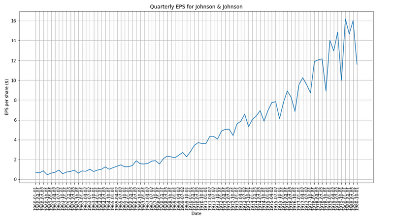
Clearly, the time series is not stationary, as its mean is not constant through time, and we see an increasing variance in the data, a sign of heteroscedasticity.
To make sure, let’s plot the PACF and ACF:
plot_pacf(data['data']);
plot_acf(data['data']);
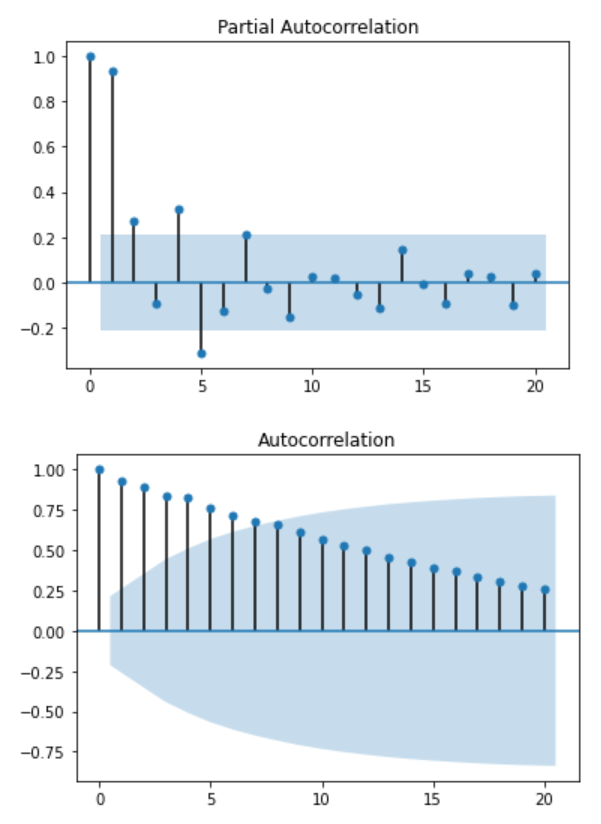
Again, no information can be deduced from those plots. You can further test for stationarity with the Augmented Dickey-Fuller test:
ad_fuller_result = adfuller(data['data'])
print(f'ADF Statistic: {ad_fuller_result[0]}')
print(f'p-value: {ad_fuller_result[1]}')
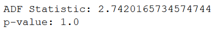
Since the p-value is large, we cannot reject the null hypothesis and must assume that the time series is non-stationary.
Now, let’s take the log difference in an effort to make it stationary:
data['data'] = np.log(data['data'])
data['data'] = data['data'].diff()
data = data.drop(data.index[0])
Plotting the new data should give:
plt.figure(figsize=[15, 7.5]); # Set dimensions for figure
plt.plot(data['data'])
plt.title("Log Difference of Quarterly EPS for Johnson & Johnson")
plt.show()
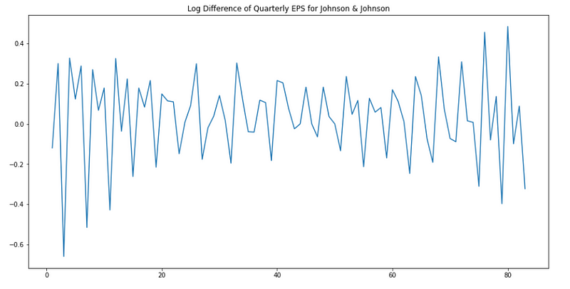
Awesome! Now, we still see the seasonality in the plot above. Since we are dealing with quarterly data, our period is 4. Therefore, we will take the difference over a period of 4:
# Seasonal differencing
data['data'] = data['data'].diff(4)
data = data.drop([1, 2, 3, 4], axis=0).reset_index(drop=True)
Plotting the new data:
plt.figure(figsize=[15, 7.5]); # Set dimensions for figure
plt.plot(data['data'])
plt.title("Log Difference of Quarterly EPS for Johnson & Johnson")
plt.show()
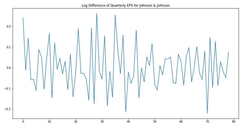
Perfect! Keep in mind that although we took the difference over a period of 4 months, the order of seasonal differencing (D) is 1, because we only took the difference once.
Now, let’s run the Augmented Dickey-Fuller test again to see if we have a stationary time series:
ad_fuller_result = adfuller(data['data'])
print(f'ADF Statistic: {ad_fuller_result[0]}')
print(f'p-value: {ad_fuller_result[1]}')
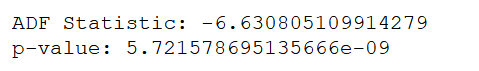
Indeed, the p-value is small enough for us to reject the null hypothesis, and we can consider that the time series is stationary.
Taking a look at the ACF and PACF:
plot_pacf(data['data']);
plot_acf(data['data']);
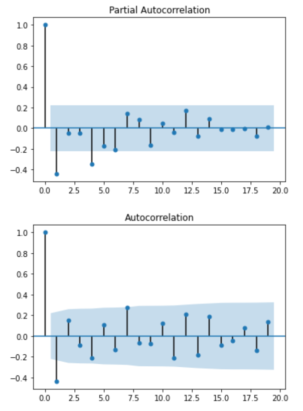
We can see from the PACF that we have a significant peak at lag 1, which suggest an AR(1) process. Also, we have another peak at lag 4, suggesting a seasonal autoregressive process of order 1 (P = 1).
Looking at the ACF plot, we only see a significant peak at lag 1, suggesting a non-seasonal MA(1) process.
Although these plots can give us a rough idea of the processes in play, it is better to test multiple scenarios and choose the model that yield the lowest AIC.
Therefore, let’s write a function that will test a series of parameters for the SARIMA model and output a table with the best performing model at the top:
def optimize_SARIMA(parameters_list, d, D, s, exog):
    """
        Return dataframe with parameters, corresponding AIC and SSE

        parameters_list - list with (p, q, P, Q) tuples
        d - integration order
        D - seasonal integration order
        s - length of season
        exog - the exogenous variable
    """

    results = []

    for param in tqdm_notebook(parameters_list):
        try:
            model = SARIMAX(exog, order=(param[0], d, param[1]), seasonal_order=(param[2], D, param[3], s)).fit(disp=-1)
        except:
            continue

        aic = model.aic
        results.append([param, aic])

    result_df = pd.DataFrame(results)
    result_df.columns = ['(p,q)x(P,Q)', 'AIC']
    #Sort in ascending order, lower AIC is better
    result_df = result_df.sort_values(by='AIC', ascending=True).reset_index(drop=True)

    return result_df
Note that we will only test different values for the parameters p, P, q and Q. We know that both seasonal and non-seasonal integration parameters should be 1, and that the length of the season is 4.
Therefore, we generate all possible parameters combination:
p = range(0, 4, 1)
d = 1
q = range(0, 4, 1)
P = range(0, 4, 1)
D = 1
Q = range(0, 4, 1)
s = 4
parameters = product(p, q, P, Q)
parameters_list = list(parameters)
print(len(parameters_list))
And you should see that we get 256 unique combinations! Now, our function will fit 256 different SARIMA models on our data to find the one with the lowest AIC:
result_df = optimize_SARIMA(parameters_list, 1, 1, 4, data['data'])
result_df
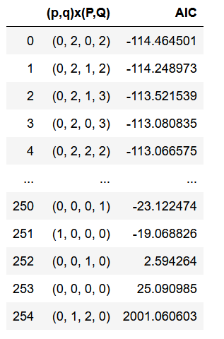
From the table, you can see that the best model is: SARIMA(0, 1, 2)(0, 1, 2, 4).
We can now fit the model and output its summary:
best_model = SARIMAX(data['data'], order=(0, 1, 2), seasonal_order=(0, 1, 2, 4)).fit(dis=-1)
print(best_model.summary())
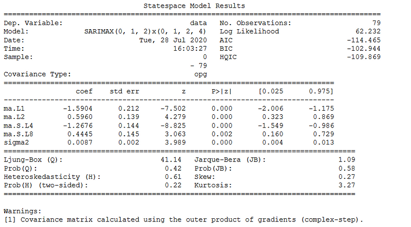
Here, you see that the best performing model has both seasonal and non-seasonal moving average processes.
From the summary above, you can find the value of the coefficients and their p-value. Notice that from the p-value, all coefficients are significant.
Now, we can study the residuals:
best_model.plot_diagnostics(figsize=(15,12));
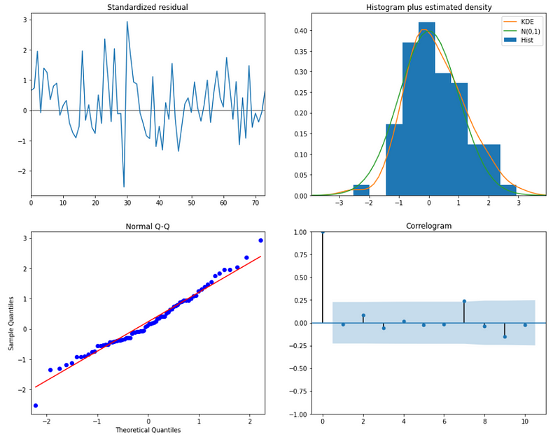
From the normal Q-Q plot, we can see that we almost have a straight line, which suggest no systematic departure from normality. Also, the correlogram on the bottom right suggests that there is no autocorrelation in the residuals, and so they are effectively white noise.
We are ready to plot the predictions of our model and forecast into the future:
data['arima_model'] = best_model.fittedvalues
data['arima_model'][:4+1] = np.NaN
forecast = best_model.predict(start=data.shape[0], end=data.shape[0] + 8)
forecast = data['arima_model'].append(forecast)
plt.figure(figsize=(15, 7.5))
plt.plot(forecast, color='r', label='model')
plt.axvspan(data.index[-1], forecast.index[-1], alpha=0.5, color='lightgrey')
plt.plot(data['data'], label='actual')
plt.legend()
plt.show()
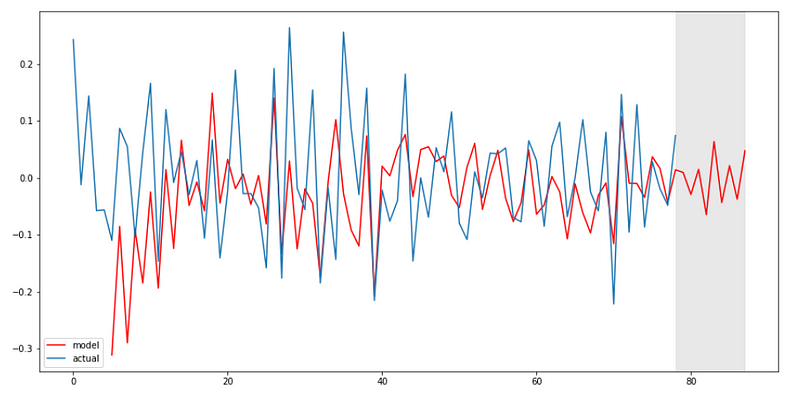
Voilà!
Conclusion
Congratulations! You now understand what a seasonal ARIMA (or SARIMA) model is and how to use it to model and forecast.
Learn more about time series with my free time series cheat sheet!
Cheers 🍺
Support me
Enjoying my work? Show your support with Buy me a coffee, a simple way for you to encourage me, and I get to enjoy a cup of coffee! If you feel like it, just click the button below 👇

Stay connected with news and updates!
Join the mailing list to receive the latest articles, course announcements, and VIP invitations!
Don't worry, your information will not be shared.
I don't have the time to spam you and I'll never sell your information to anyone.
