Sample Paths for Uncertainty Quantification in Time Series Forecasting
Mar 31, 2026
Uncertainty quantification is a crucial aspect in time series forecasting. For each forecast we make, there is some uncertainty to it. This uncertainty, expressed as a prediction interval, often comes from a probabilistic loss like a quantile loss for example.
What is often unaddressed is that these intervals represent marginal forecast distributions, and they are independent of one time step to the next.
However, time series data is often autocorrelated, meaning that past values impact future values. As such, in certain situations, predictions intervals must also take that into account, such that we estimate joint forecast distributions. This is achieved with sample paths or simulation paths.
In this article, we first explore the difference between marginal and joint forecast distributions and learn when each is useful and what types of questions it can answer. Then, we apply our learning in a hands-on experiment using Python.
Many thanks go to Tim Radtke and his blog post When Quantiles Do Not Suffice, Use Sample Paths Instead for inspiring this article.
Learn the latest time series forecasting techniques with my free time series cheat sheet in Python! Get the implementation of statistical and deep learning techniques, all in Python and TensorFlow!
Let’s get started!
Understanding marginal distributions
Most of the time, forecasting packages output the marginal distribution. This represents the range of possible values at a single point in time.

In the figure above, we visualize the case of forecasting daily sales of different products in a bakery. The solid represents the point forecast, whereas the shaded area represents the 80% prediction interval.
In this case, the interval is really the marginal distribution.
As mentioned above, the uncertainty is quantified for each point in time independent of the others.
Although we are plotting continuous lines, the information being displayed comes from the equations below:


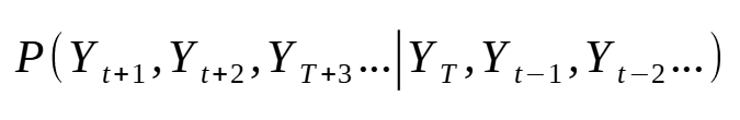
The equations are above are read as: the probability of Y at t+1 given Y at t, Y at t-1, and so on. In other words, what is the probability of a future value, at a single time step, given past values.
Again, because this is a marginal distribution, the probability of Y at t+1 and completely independent of that of Y at t+2. They are separate distributions.
With this type of distribution we can say:
- There is an 80% probability that baguette sales will be between 55 and 22 units on September 25th.
- We should prepare 50 baguettes to ensure we serve 80% of customers on September 25th.
The key is that we have information for a single time step, independent of what happens before or after.
This is not bad in itself. We can still answer relevant questions from these predictions intervals.
Now, what if we ask the question:
- how many baguettes should we prepare for next 7 days to ensure we serve 80% of customers?
Now the marginal distribution is not enough to answer this question.
Here, we must consider a cumulative uncertainty, since we are interested in what will happen over the course of the next seven days.
Also, it is possible that what happens on the 7th day is influenced by what happened on the 5th or the 6th day. For example, maybe that week is leading up to a holiday and so people buy more baguettes over the week.
In order to answer these types of questions, we must turn our attention to the joint distribution.
Understanding joint distributions
Unlike the marginal distribution, the joint distribution takes into account the influence of previous time steps.
As such, the joint distribution is expressed as:
In the equation above, we now take into account how future time steps interact with one another. This is often the case in time series data due to autocorrelation, where past values directly impact future values.
Whereas the marginal distribution discarded the correlation between future time steps, the joint distribution takes it into account.
Now, all of this matters because the sum of quantiles is not the quantiles of the sum.
In other words, we cannot estimate the joint distribution from the marginal distribution using a simple sum. We must find ways to introduce information about correlation and interaction between time steps to get the joint distribution.
However, we can approximate the marginal distribution from the joint distribution, making it a more complete and robust assessment of uncertainty.
Now, the way to estimate the joint distribution is by generating sample paths.
Generating sample paths
There are many ways to generate sample paths, and the neat part is that they use the marginal distribution as the starting point.
Here, let’s explore how we can generate sample paths using the Gaussian copula method.
Sample paths with Gaussian copula
As mentioned, the starting point is the marginal distribution for each time step in the forecast horizon. These can come from various probabilistic losses, like a multiquantile loss, interquantile loss, or distribution loss.
Then, we use an AR(1) model, a first-order autoregressive model, to estimate the autocorrelation coefficient from the historical data. Note that in this step, the series are differenced since the AR model can only be applied on stationary data. With this coefficient, we know how strong is the impact between adjacent time steps.
Next, we build the Toeplitz correlation matrix. This is a representation of a stationary process where the autocorrelation coefficient only depends on the distance between two time steps. In other words, if two values are 4 days apart, no matter what day of the week they fall on, they will have the same autocorrelation coefficient.
Then, to sample from a multivariate Gaussian, we need the Cholesky factor. This is done through the Cholesky decomposition, which is simply a numerical method to compute the factor from the Toeplitz correlation matrix.
With the Cholesky factor in hand, we can draw correlated samples. We first draw independent standard normal vectors, one per sample path, and then multiply them by the Cholesky factor. This linear transformation reshapes the independent draws so that they follow the multivariate Gaussian with the AR(1) correlation structure we built earlier.
The samples are now correlated across the forecast horizon, but their marginal distributions are still standard normal.
To convert them into something useful, we apply the standard normal cumulative distribution function (CDF) to each value. This maps every correlated normal draw to a number between 0 and 1. This is the copula step: after this transformation, each sample path is a sequence of correlated uniforms that preserve the rank correlation structure of the AR(1) Gaussian.
The final step is to bring these back to the actual forecast scale. For each time step in the horizon, we treat the model’s quantile forecasts as a piecewise-linear quantile function. Next, we feed the correlated uniform values through it. This is the inverse CDF transform: a uniform value of 0.85, for example, becomes the value at the 85th percentile of the predicted distribution for that step.
The result is a set of sample paths that respect both the marginals the model learned and the temporal correlation structure estimated from history.
That was a lot of information! Now, the method described above is a parametric method, since we use a Gaussian copula and the AR(1) model. There are non-parametric methods to estimate dependence from historical data only, like the Schaake shuffle method, but we will leave it out of this article.
Now that we have a deeper understanding of joint distributions and how we can draw simulation paths from them, let’s apply that in a hands-on example using Python.
Hands-on with sample paths in Python
For this applied tutorial, we use a dataset compiling the daily sales of various products in a french bakery. This dataset was publicly released by Matthieu Gimbert on Kaggle.
As always, the full solutions notebook is available on GitHub.
Let’s get started!
Imports and setup
First, let’s cover the necessary imports for this small project. Here, we work with neuralforecast, an open-source forecasting package implementing state-of-the-art deep learning models.
Since the release of v.3.1.6, the library support sample paths for all models, so we will be able to apply our learning easily with neuralforecast.
import logging
import warnings

import matplotlib.pyplot as plt
import numpy as np
import pandas as pd

from utilsforecast.plotting import plot_series
from neuralforecast import NeuralForecast
from neuralforecast.losses.pytorch import MQLoss
from neuralforecast.models import NHITS

warnings.filterwarnings("ignore")
logging.getLogger("pytorch_lightning").setLevel(logging.ERROR)
Note that we will use the MQLoss, the multiquantile loss, as our probabilistic loss. From there, we will be able to generate sample paths.
Then, we can read our data. As mentioned before, this dataset compiles the daily sales of various products of a french bakery.
Here, let’s focus solely on sales of baguette. Also, the price of each time is in the data, but it’s not a relevant feature, since there are no promotions; the price just steadily increases.
df = pd.read_csv("https://raw.githubusercontent.com/marcopeix/youtube_tutorials/refs/heads/main/data/daily_sales_french_bakery.csv", parse_dates=["ds"])
df = df[df["unique_id"] == "BAGUETTE"]
df = df.drop(columns=["unit_price"])
We can optionally plot the series as shown below.

Great! We are now ready to fit a model.
Fitting a model
Here, we fit a simple NHITS model. Again, any model will work as long as we use a probabilistic loss.
HORIZON = 7

nhits = NHITS(
    h=HORIZON,
    input_size=4*HORIZON,
    loss=MQLoss(level=[80,90]),
    scaler_type="robust",
    max_steps=1000,
)

nf = NeuralForecast(models=[nhits], freq="D")

nf.fit(df)
In the code block above, we set the horizon to 7 days. Then, we specify the MQLoss as the training loss for the model. Note that we specify level=[80,90], meaning that we will get boundaries for the 80% and 90% prediction intervals. Keep in mind that those distributions are marginal distributions.
From there, we can predict the next 7 days and display the marginal distribution in a plot.
fcsts = nf.predict()
fcsts = fcsts.rename(columns={"NHITS-median": "NHITS"})

plot_series(df, fcsts, level=[80, 90], max_insample_length=5*HORIZON)

In the figure above, the boundaries are very tight, so it is hard to distinguish them.
Again, the boundaries of each time step are independent from one another. To get the joint distributions, we need sample paths.
Getting sample paths
In neuralforecast, we can obtain sample paths with the simulate method. Simply specify the number of paths and the seed for reproducibility.
Note that the more samples you take, the closer it will be to the true joint distribution. In general, sampling 100 paths is a good starting point.
N_PATHS = 100
SEED = 42

sample_paths_df = nf.simulate(n_paths=N_PATHS, seed=SEED)
This produces the following DataFrame:

In the DataFrame above, we can see that we a sample path, denoted by the sample_id, for each step in the horizon, denoted by ds, for each series and each model. In this case, we only have one series (BAGUETTE) and one model (NHITS).
Optionally, we can plot the prediction interval coming from the joint distribution.
def plot_sample_paths_intervals(df, sample_paths_df, unique_id, n_hist=90, model_col="NHITS"):
    series_df = df[df["unique_id"] == unique_id].tail(n_hist)
    paths = sample_paths_df[sample_paths_df["unique_id"] == unique_id]

    intervals = paths.groupby("ds")[model_col].quantile([0.05, 0.10, 0.90, 0.95]).unstack()
    intervals.columns = ["lo_90", "lo_80", "hi_80", "hi_90"]
    intervals = intervals.reset_index()

    median = paths.groupby("ds")[model_col].median().reset_index()

    fig, ax = plt.subplots(figsize=(12, 5))

    ax.plot(series_df["ds"], series_df["y"], color="black", label="Historical")
    ax.plot(median["ds"], median[model_col], color="#1f77b4", label="Median forecast")
    ax.fill_between(intervals["ds"], intervals["lo_80"], intervals["hi_80"],
                    alpha=0.4, color="#1f77b4", label="80% PI")
    ax.fill_between(intervals["ds"], intervals["lo_90"], intervals["hi_90"],
                    alpha=0.2, color="#1f77b4", label="90% PI")

    ax.set_title(f"{unique_id} — Simulation paths with prediction intervals")
    ax.set_xlabel("Date")
    ax.set_ylabel("Sales")
    ax.legend()
    plt.tight_layout()
    plt.show()

plot_sample_paths_intervals(df, sample_paths_df, unique_id="BAGUETTE")
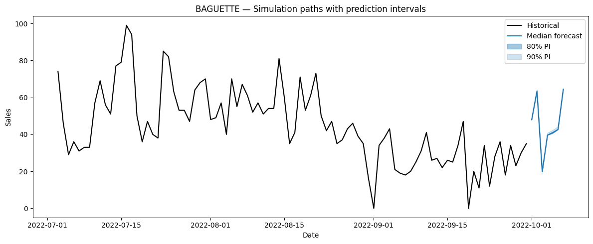
Once again, the boundaries are tight, but they are not identical to the ones obtained from the marginal distribution.
From here, we can now answer questions that require information from the joint distribution!
How many baguettes should be baked to serve at least 80% of the customers in the next 7 days?
To answer the question above, we simply get the total sales from each sample paths and calculate the 80th percentile. This will tell us how many baguettes must be baked during the week to serve at least 80% of the customers.
weekly_demand = sample_paths_df.groupby("sample_id")["NHITS"].sum()
target = weekly_demand.quantile(0.80)

fig, ax = plt.subplots(figsize=(10, 5))

ax.hist(weekly_demand, bins=40, color="#1f77b4", alpha=0.7, edgecolor="white")
ax.axvline(target, color="red", linestyle="--", label=f"80th percentile: {target:.0f} baguettes")

ax.set_title("Distribution of total weekly baguette demand")
ax.set_xlabel("Total baguettes sold")
ax.set_ylabel("Number of paths")
ax.legend()
plt.tight_layout()
plt.show()

print(f"Bake {target:.0f} baguettes to serve 80% of weekly demand")

From the figure above, we see that the 80th percentile is 320 baguette. This means that the bakery should expect to bake 320 baguettes in order to serve at least 80% of its customers over the course of the next 7 days.
What’s the expected worst day (lowest sales) in the next 7 days
Here, we take the lowest sale volume of each sample path. Then, from that new distribution we can take the mean to get the expected minimum sales next week.
worst_day = sample_paths_df.groupby("sample_id")["NHITS"].min()
expected_worst = worst_day.mean()

fig, ax = plt.subplots(figsize=(10, 5))

ax.hist(worst_day, bins=40, color="#1f77b4", alpha=0.7, edgecolor="white")
ax.axvline(expected_worst, color="red", linestyle="--", label=f"Expected worst day: {expected_worst:.0f} baguettes")

ax.set_title("Distribution of the worst single day over the 7-day horizon")
ax.set_xlabel("Minimum daily sales across the week")
ax.set_ylabel("Number of paths")
ax.legend()
plt.tight_layout()
plt.show()

print(f"Expected worst single day: {expected_worst:.0f} baguettes")

In the figure above, we see that 20 is the mean of the lowest sales from all sample paths. As such, we can expect that 20 baguettes will be the lowest sales volume in the next 7 days.
Conclusion
In this article, we discovered the difference between marginal and joint distributions, and how they can answer different questions.
We also explored in detail how sample paths are drawn from the joint distribution using the Gaussian copula method.
Finally, we implemented our learning with a hands-on example, using neuralforecast’s API to generate sample paths and answer questions that can only be answered by joint distributions.
I hope that this new tool will help you in your forecasting projects. Thank you so much for reading!
Learn the latest time series analysis techniques with my free time series cheat sheet in Python! Get the implementation of statistical and deep learning techniques, all in Python and TensorFlow!
Cheers 🍻
Next steps
If you are looking to level up your forecasting skills, check out some of my courses:
- Applied Time Series Forecasting in Python — the shortcut mastering time series forecasting where I teach everything I learned about forecasting, from statistical models to machine learning and deep learning models.
- Foundation Models for Time Series — take TimeGPT, Chronos, TimesFM and more, and apply them for zero-shot forecasting, fine-tune them, and incorporate exogenous features for state-of-the-art results.
References
- T. Radtke, “Minimize Regret — When Quantiles Do Not Suffice, Use Sample Paths Instead,” Minimizeregret.com, 2022. https://minimizeregret.com/post/2022/07/25/use-sample-paths/ (accessed Mar. 31, 2026).
- Nixtla.io, 2026. https://nixtlaverse.nixtla.io/neuralforecast/docs/tutorials/simulation.html (accessed Mar. 31, 2026).
Stay connected with news and updates!
Join the mailing list to receive the latest articles, course announcements, and VIP invitations!
Don't worry, your information will not be shared.
I don't have the time to spam you and I'll never sell your information to anyone.
