Practical Guide for Anomaly Detection in Time Series with Python
Mar 15, 2023
Anomaly detection in time series has a wide range of real-life applications, from manufacturing to healthcare. Anomalies indicate unexpected events, and they can be caused by production faults or system defects. For example, if we are monitoring the number of visitors on a website, and the number falls to 0, it might mean that the server is down.
It is also useful to detect anomalies in time series data before modelling for forecasting. Many forecasting models are autoregressive, meaning that they take into account past values to make predictions. A past outlier will definitely affect the model, and it can be a good idea to remove that outlier to get more reasonable predictions.
In this article, we will take a look a three different anomaly detection techniques, and implement them in Python.
- Mean absolute deviation (MAD)
- Isolation forest
- Local outlier factor (LOF)
The first one is a baseline method that can work well if the series satisfies certain assumptions. The other two methods are machine learning approaches.
Learn the latest time series analysis techniques with my free time series cheat sheet in Python! Get the implementation of statistical and deep learning techniques, all in Python and TensorFlow!
Let’s get started!
Types of anomaly detection tasks in time series
There are two main types of anomaly detection tasks with time series data:
- Point-wise anomaly detection
- Pattern-wise anomaly detection
In the first type, we wish to find single points in time that are considered abnormal. For example, a fraudulent transaction is a point-wise anomaly.
The second type is interested in finding subsequences that are outliers. An example of that could be a stock that is trading at an abnormal level for many hours or days.
In this article, we will focus only on point-wise anomaly detection, meaning that our outliers are isolated points in time.
The scenario: CPU utilization on the AWS cloud
We apply the different anomaly detection techniques on a dataset that monitors the CPU utilization on an EC2 instance in the AWS cloud. This is real-world data that was recorded every 5 minutes, starting on February 14th, 2014 at 14:30. The dataset contains 4032 data points. It was made available through the Numenta Anomaly Benchmark (NAB) under the AGPL-3.0 license.
The particular dataset for this article can be found here, and the associated labels are here. The full source code is available on GitHub.
Before we get started, we need to format our data in order to label each value as either an outlier or an inlier.
df = pd.read_csv('data/ec2_cpu_utilization.csv')

# The labels are listed in the NAB repository for each dataset
anomalies_timestamp = [
        "2014-02-26 22:05:00",
        "2014-02-27 17:15:00"
    ]

# Ensure the timestamp column is an actual timestamp
df['timestamp'] = pd.to_datetime(df['timestamp'])
Now, an outlier gets a label of -1, and an inlier gets a label of 1. This matches the output of anomaly detection algorithms in scikit-learn.
df['is_anomaly'] = 1

for each in anomalies_timestamp:
    df.loc[df['timestamp'] == each, 'is_anomaly'] = -1
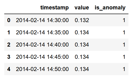
At this point, we have a dataset with the right timestamp format, the value, and a label to indicated whether the value is an outlier (-1) or an inlier (1).
Now, let’s plot the data to visualize the anomalies.
anomaly_df = df.loc[df['is_anomaly'] == -1]
inlier_df = df.loc[df['is_anomaly'] == 1]

fig, ax = plt.subplots()

ax.scatter(inlier_df.index, inlier_df['value'], color='blue', s=3, label='Inlier')
ax.scatter(anomaly_df.index, anomaly_df['value'], color='red', label='Anomaly')
ax.set_xlabel('Time')
ax.set_ylabel('CPU usage')
ax.legend(loc=2)

fig.autofmt_xdate()
plt.tight_layout()
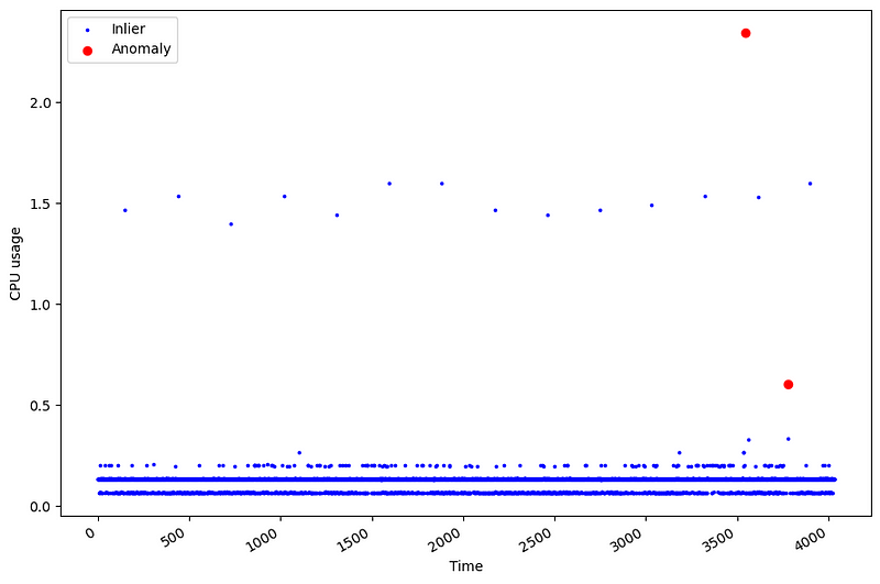
From the figure above, we can see that our data only contains two outliers, as indicated by the red dots.
This shows how challenging anomaly detection can be! Because they are rare events, we have few occasions to learn from them. In this case, only 2 points are outliers, which represent 0.05% of the data. It also makes the evaluation of the models more challenging. A method basically has two occasions of getting it right, and 4030 occasions of being wrong.
With all that in mind, let’s apply some techniques for anomaly detection in time series, starting with the mean absolute deviation.
Mean absolute deviation (MAD)
If our data is normally distributed, we can reasonably say that data points at each end of the tails can be considered an outlier.
To identify them, we can use the Z-score, which is a measurement in terms of standard deviations from the mean. If the Z-score is 0, the value is equal to the mean. Typically, we set a Z-score threshold of 3 or 3.5 to indicate if a value is an outlier or not.
Now, recall that the Z-score is calculated as

Where mu is the mean of the sample and sigma is the standard deviation. Basically, if the Z-score is large, it means that the value is far from the mean and towards one end of the distribution’s tail, which in turn can mean that it is an outlier.
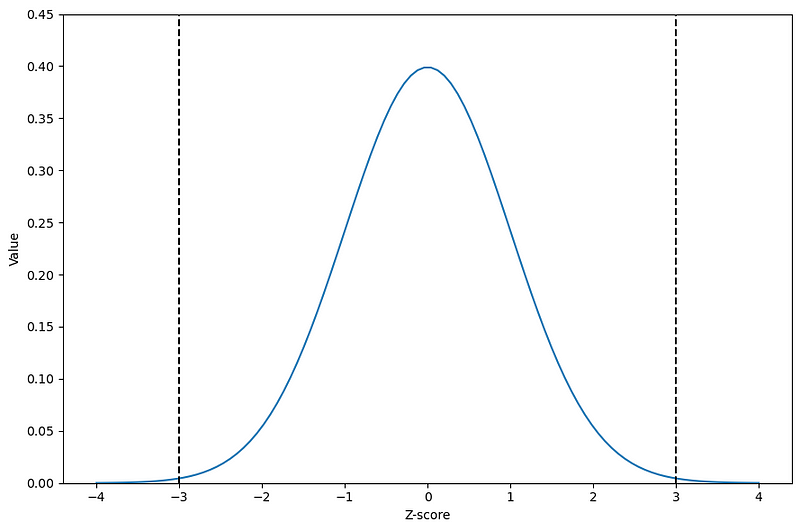
From the figure above, we can visualize the classical Z-score threshold of 3 to determine if a value is an outlier or not. As shown by the black dashed lines, a Z-score of 3 brings us to the ends of the normal distribution. So, any value with a Z-score greater than 3 (or less than -3 if we are not working in absolute values) can be labelled as an outlier.
Now, this works great under the assumption that we have a perfectly normal distribution, but the presence of outliers necessarily affects the mean, which in turns affect the Z-score. Therefore, we turn our attention to the mean absolute deviation or MAD.
The robust Z-score method
To avoid the influence of outliers on the Z-score, instead use the median, which is a more robust metric in the presence of outliers.
The median absolute deviation or MAD is defined as:
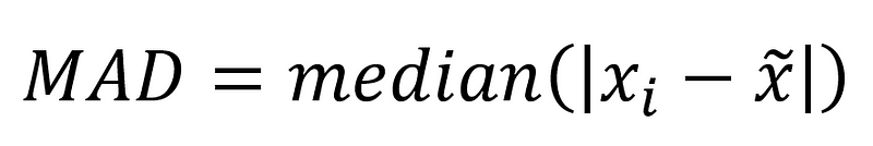
Basically, the MAD is the median of the absolute difference between the values of a sample and the median of the sample. Then, we can calculate the robust Z-score with:

Here, the robust Z-score takes the difference between a value and the median of the sample, multiplies it by 0.6745 and we divide everything by the MAD. Note that 0.6745 represents the 75th percentile of a standard normal distribution.
Why 0.6745? (optional read)
Unlike the traditional Z-score, the robust Z-score uses the median absolute deviation, which is always smaller than the standard deviation. Thus, to obtain a value that resembles a Z-score, we must scale it.
In a normal distribution with no outliers, the MAD is about 2/3 (0.6745 to be precise) as big as the standard deviation. Therefore, because we are dividing by the MAD, we multiply by 0.6745 to get back to the scale of the normal Z-score.
The robust Z-score method will work best under two important assumptions:
- The data is close to a normal distribution
- The MAD is not equal to 0 (happens when more than 50% of the data has the same value)
The second point is interesting, because if that is the case, then any value that is not equal to the median will be flagged as an outlier, no matter the threshold, since the robust Z-score will be incredibly large.
With all that in mind, let’s apply this method to our scenario.
Applying the MAD for outlier detection
First, we need to check the distribution of our data.
import seaborn as sns

sns.kdeplot(df['value']);
plt.grid(False)
plt.axvline(0.134, 0, 1, c='black', ls='--')
plt.tight_layout()
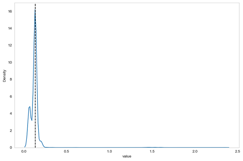
From the figure above, we can already see two problems. First, the data is close to a normal distribution. Second, the black dashed line indicates the median of the sample, and it fall right on the peak of the distribution. This means that a lot of data points are equal to the median, meaning that we are in a situation where the MAD is potentially 0 or very close to 0.
Nevertheless, let’s continue applying the method, just so that we understand how to work with it.
The next step, is to compute the MAD and the median of the sample to calculate the robust Z-score. The scipy package comes with an implementation of the MAD formula.
from scipy.stats import median_abs_deviation

mad = median_abs_deviation(df['value'])
median = np.median(df['value'])
Then, we simply write a function to calculate the robust Z-score and create a new column to store the score.
def compute_robust_z_score(x):
    return .6745*(x-median)/mad

df['z-score'] = df['value'].apply(compute_robust_z_score)
Note that we get a MAD of 0.002, which definitely close to 0, meaning that this baseline is likely not going to perform very well.
Once this is done, we decide on a threshold to flag outliers. A typical threshold is 3 or 3.5. In this case, any value with a robust Z-score greater than 3.5 (right-hand tail) or smaller than -3.5 (left-hand tail) will be flagged as an outlier.
df['baseline'] = 1

df.loc[df['z-score'] >= 3.5, 'baseline'] = -1 # Right-end tail
df.loc[df['z-score'] <=-3.5, 'baseline'] = -1 # Left-hand tail
Finally, we can plot a confusion matrix to see if our baseline correctly identified outliers and inliers.
from sklearn.metrics import confusion_matrix, ConfusionMatrixDisplay

cm = confusion_matrix(df['is_anomaly'], df['baseline'], labels=[1, -1])

disp_cm = ConfusionMatrixDisplay(cm, display_labels=[1, -1])

disp_cm.plot();

plt.grid(False)
plt.tight_layout()

Unsurprisingly, we see that the baseline method performs poorly, since 1066 inliers were flagged as outliers. Again, this was expected since our data did not respect the assumptions of the method, and the MAD was very close to 0. Still, I wanted to cover the implementation of this method in case it serves you in another scenario.
Although the results are disappointing, this method still holds when the assumptions are true for your dataset, and you now know how to apply it when it makes sense.
Now, let’s move on to the machine learning approached, starting with isolation forest.
Isolation Forest
The isolation forest algorithm is a tree-based algorithm that is often used for anomaly detection.
The algorithm starts by randomly selecting an attribute and randomly selecting a split value between the maximum and minimum values for that attribute. This partitioning is done many times until the algorithm has isolated each point in the dataset.
Then, the intuition behind this algorithm is that an outlier will take fewer partitions to be isolated than a normal point, as shown in the figures below.
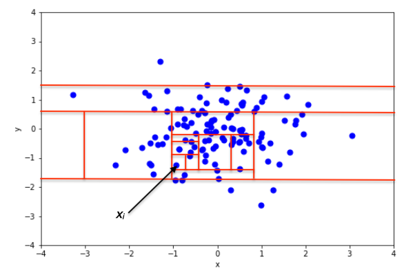
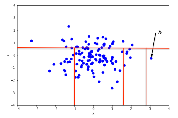
In the two figures above, we can see how the number of partitions differ when isolating an inlier and an outlier. In the top figure, isolating an inlier required many splits. In the bottom figure, fewer splits were necessary to isolate the point. Therefore, it is likely to be an anomaly.
So we see how in an isolation forest, if the path to isolate a data point is short, then it is an anomaly!
Applying the isolation forest
First, let’s split our data into a training and a test set. That way, we can evaluate if the model is able to flag an anomaly on unseen data. This is sometimes called novelty detection, instead of anomaly detection.
train = df[:3550]
test = df[3550:]
Then, we can train our isolation forest algorithm. Here, we need to specify a level of contamination, which is simply the fraction of outliers in the training data. In this case, we only have one outlier in the training set.
from sklearn.ensemble import IsolationForest

# Only one outlier in the training set
contamination = 1/len(train)

iso_forest = IsolationForest(contamination=contamination, random_state=42)

X_train = train['value'].values.reshape(-1,1)

iso_forest.fit(X_train)
Once trained, we can then generate predictions.
preds_iso_forest = iso_forest.predict(test['value'].values.reshape(-1,1))
Again, we can plot the confusion matrix to see how the model performs.
cm = confusion_matrix(test['is_anomaly'], preds_iso_forest, labels=[1, -1])

disp_cm = ConfusionMatrixDisplay(cm, display_labels=[1, -1])

disp_cm.plot();

plt.grid(False)
plt.tight_layout()

From the figure above, we notice that the algorithm was not able to flag the new anomaly. It also labelled an anomaly as a normal point.
Again, this is a disappointing result, but we still have one more method to cover, which is the local outlier factor.
Local outlier factor
Intuitively, the local outlier factor (LOF) works by comparing the local density of a point to the local densities of its neighbours. If the densities of the point and its neighbours are similar, then the point is an inlier. However, if the density of the point is much smaller than the densities of its neighbours, then it must be an outlier, because a lower density means that the point is more isolated.
Of course, we need to set the number of neighbours to look at, and scikit-learn’s default parameter is 20, which works well in most cases.
Once the number of neighbours is set, we calculate the reachability distance. It is a bit tricky to explain this with words and pictures only, but I will do my best.
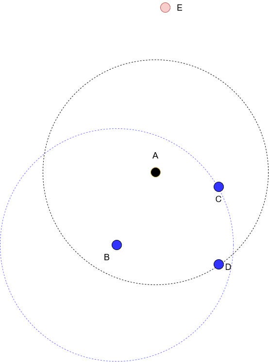
Suppose that we are studying point A, and that we set the number of neighbours to 3 (k=3). Drawing a circle while keeping point A in the middle results in the black dotted circle you see in the figure above. Points B, C and D are the three closest neighbours to A, and point E is too far in this case, so it is ignored.
Now, the reachability distance is defined as:

In words, the reachability distance from A to B is the largest value between the k-distance of B and the actual distance from A to B.
The k-distance of B is simply the distance from point B to its third nearest neighbour. That’s why in the figure above, we drew a blue dotted circle with B at its center, to realize that the distance from B to C is the k-distance of B.
Once the reachability distance is calculated for all the k-nearest neighbours of A, the local reachability density will be computed. This is simply the inverse of the average of the reachability distances.
Intuitively, the reachability density tells us how far we have to travel to reach a neighbouring point. If the density is large, then points are close together and we don’t have too travel for long.
Finally, the local outlier factor, is simply a ratio of the local reachability densities. In the figure above, we set k to 3, so we would have three ratios that we would average. This allows us to compare the local density of a point to its neighbour.
As mentioned before, if that factor is close to 1 or smaller than 1, then it is a normal point. If it is much larger than 1, then it is an outlier.
Of course, this methods comes with drawbacks, as a value that is larger than 1 is not a perfect threshold. For example, an LOF of 1.1 could mean an outlier for a dataset, and not for another one.
Applying the local outlier factor method
With the use of scikit-lean applying the local outlier factor method is straightforward. We use the same train/test split as for the isolation forest to have comparable results.
from sklearn.neighbors import LocalOutlierFactor

lof = LocalOutlierFactor(contamination=contamination, novelty=True)

lof.fit(X_train)
Then, we can generate the predictions to flag potential outliers in the test set.
preds_lof = lof.predict(test['value'].values.reshape(-1,1))
Finally, we plot the confusion matrix to evaluate the performance.
cm = confusion_matrix(test['is_anomaly'], preds_lof, labels=[1, -1])

disp_cm = ConfusionMatrixDisplay(cm, display_labels=[1, -1])

disp_cm.plot();
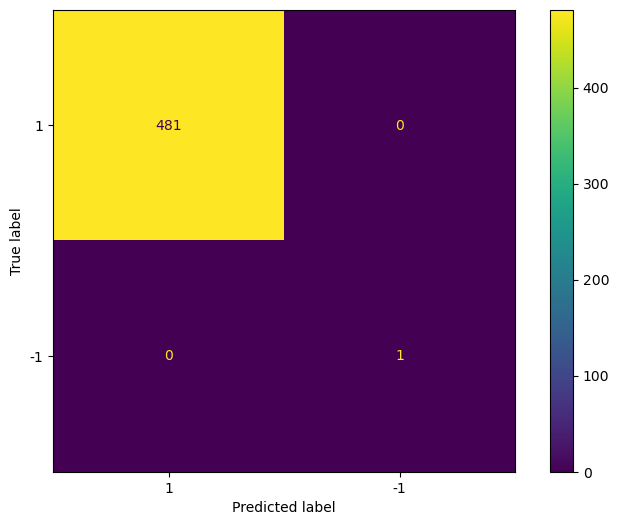
In the figure above we see that the LOF method was able to flag the only outlier in the test set, and correctly labelled every other point as a normal point.
As always, this does not mean that local outlier factor is better method than isolation forest. It simply means that it worked better in this particular situation.
Conclusion
In this article, we explored three different methods for outlier detection in time series data.
First, we explored a robust Z-score that uses the mean absolute deviation (MAD). This works well when your data is normally distributed and if your MAD is not 0.
Then, we looked at isolation forest, which a machine learning algorithm that determines how many times a dataset has to be partitioned in order to isolate a single point. If few partitions are necessary, then the point is an outlier. If many partitions are required, then the point is likely an inlier.
Finally, we looked at the local outlier factor (LOF) method, which is an unsupervised learning method that compares the local density of a point to that of its neighbours. Basically, if the density of a point is small compared to its neighbours, it means it is an isolated point, and likely an outlier.
I hope that you enjoyed this article and learned something new!
Cheers 🍻
Support me
Enjoying my work? Show your support with Buy me a coffee, a simple way for you to encourage me, and I get to enjoy a cup of coffee! If you feel like it, just click the button below 👇

Stay connected with news and updates!
Join the mailing list to receive the latest articles, course announcements, and VIP invitations!
Don't worry, your information will not be shared.
I don't have the time to spam you and I'll never sell your information to anyone.
