
Introduction to Causal Analysis in Time Series
Jul 26, 2026
Every time I publish a new article, the traffic to my blog jumps. What usually happens is a spike the day I publish and it quietly fades back to normal.
So I ask myself a simple question:
How many extra visitors come when I publish a new article?
This is really a causal question, because I am assuming that the number of visitors would be different if no new article was published, which is a fair assumption.
The real challenge is in quantifying the causal impact of my publishing a new post.
In this article, we discover my journey in measuring the causal impact of publishing an article, which can easily be transferred in other scenarios involving time series data.
The entire code of this article is available on GitHub.
Learn the latest time series forecasting techniques with my 👉 free time series cheat sheet 👈 in Python! Get the implementation of statistical and deep learning techniques, all in Python and TensorFlow!
Let’s get started!
Getting to know the data
First, let’s plot the data to visually see that posting an article indeed results in a spike of visitors.
import datetime
import numpy as np, pandas as pd
import matplotlib.pyplot as plt
import statsmodels.formula.api as smf
import lightgbm as lgb, shap
from mlforecast import MLForecast

DATA_URL = ("https://raw.githubusercontent.com/marcopeix/time-series-analysis/"
            "refs/heads/master/data/medium_views_published_holidays.csv")

def load_data(path=DATA_URL):
    df = pd.read_csv(path)
    df["ds"] = pd.to_datetime(df["ds"])
    df = df.sort_values("ds").reset_index(drop=True)
    df["published"] = df["published"].astype(int)
    # Features we'll reuse everywhere:
    df["dow"] = df["ds"].dt.dayofweek    # 0 = Monday ... 6 = Sunday
    df["t"] = np.arange(len(df))         # linear time index, for the trend
    return df

df = load_data()

published_dates = df[df['published'] == 1]

fig, ax = plt.subplots(figsize=(12,8), dpi=300)

ax.plot(df['ds'], df['y'])
ax.scatter(published_dates['ds'], published_dates['y'], marker='o', color='red', label='New article')
ax.set_xlabel('Day')
ax.set_ylabel('Total views')
ax.legend(loc='best')
ax.set_xlim([datetime.date(2023, 1, 1), datetime.date(2023, 10, 12)])

fig.autofmt_xdate()
plt.tight_layout()
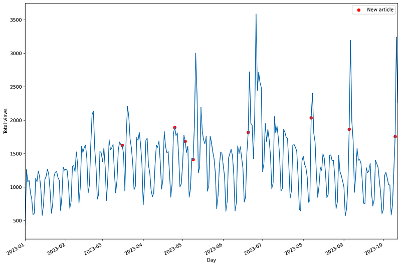
My dataset consists of daily traffic volume from January 1st 2020 to October 12th 2023, thus spanning 1381 days. In the figure above, red dots indicate that a new article was published.
Visually, we can see that whenever an article is released, a peak of visitors occurs. This tends to happen either the day of publishing or the following day, and then traffic returns to normal.
Also notice the strong seasonality; weekends see less traffic than weekdays.
With that in mind, my first attempt at explaining the impact of publishing articles was to use Shapley values.
SHAP values and why it fails (for now)
Shapley values, computed with the popular shap package, are a popular tool for model explainability.
Thus, assuming I can build a good forecasting model that uses information about when I publish an article, I can then extract the Shapley values of each feature and see how publishing impacts the final forecast.
Let’s use MLForecast along with the LightGBM model to fit a forecasting model to my data.
mlf_df = df[["unique_id", "ds", "y", "published", "is_holiday"]].copy()

fcst = MLForecast(
    models={"lgb": lgb.LGBMRegressor(n_estimators=400,
                                     learning_rate=0.03,
                                     num_leaves=31,
                                     verbose=-1)},
    freq="D", lags=[1, 2, 3, 7], date_features=["dayofweek"],
)
prep = fcst.preprocess(mlf_df, static_features=[])
fcst.fit(mlf_df, static_features=[])
In the code block above, we first get the data and relevant columns, including the flag for a published article and for a holiday.
Then, we build the MLForecast object that wraps the LightGBM model. We specify the frequency of the data (daily), add past lags as features, and build date features to indicate the day of the week. This is especially important given that we observed a strong weekly seasonality in the data.
Then, we explicitly create the prep DataFrame with all the specified features. This will be useful when extracting SHAP values. Finally, we fit the model.
Once the model is fitted, we can extract the Shapley values and plot their mean value.
feats = [c for c in prep.columns if c not in ("unique_id", "ds", "y")]
sv = pd.DataFrame(shap.TreeExplainer(fcst.models_["lgb"]).shap_values(prep[feats]),
                  columns=feats, index=prep.index)
importance = sv.abs().mean().sort_values(ascending=False)
imp = importance.sort_values()

colors = [C_FLAG if n == "published" else "#7FA8D0" for n in imp.index]

fig, ax = plt.subplots(figsize=(8, 4.5))

ax.barh(imp.index, imp.values, color=colors)
ax.set_xlabel("Global importance (mean |SHAP|, views)")
ax.set_title("Mean SHAP value per feature", fontweight="bold", loc="left")

for s in ("top", "right"): ax.spines[s].set_visible(False)

plt.show()
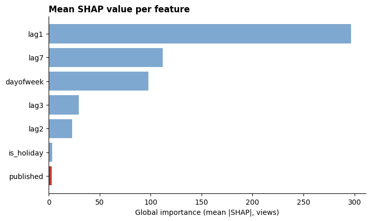
From the figure above, we notice that the feature published is actually not that important, at least according to Shapley values.
As such, the one action I take to generate more traffic does not seem to matter. But that does not make sense, because we clearly saw that peaks only happen when a new article was published.
So why are we seeing this?
Attribution is not causation
Shapley values are a measure of feature attribution. In other words, it calculates how a feature contributed to the machine learning’s output.
Causation, on the other hand, attempts to establish a direct cause-and-effect relationship that can be used for strategic planning.
So, from the calculated SHAP values, we can say that LightGBM heavily relies on yesterday’s traffic to predict today’s traffic. But it’s not helping us answer our original question:
How many extra visitors come when I publish a new article?
We will see later how we could trick SHAP values to measure the causal effect.
For now, we must turn our attention to interrogate the data and not the model.
Framing my question as a causal task
My question can be answered with the help of counterfactuals. A counterfactual is a conditional statement for a reality that did not materialize.
For example, the reality is that I brushed my teeth this morning so my breath smells good. The counterfactual is: had I not brushed my teeth this morning, my breath would smell bad.
My question about the causal impact of publishing an article can be framed similarly.
The reality is that I published a new post on day t and the number of visits were Y. The counterfactual is then: had I not published on day t the number of visits would be Y0.
Therefore, the causal impact of publishing an article is difference Y — Y0.
Sounds simple enough!
But we have to watch out for confounders. A confounder is a common cause of the outcome I am observing. They are dangerous because I might attribute the impact only to my publishing, whereas something else impacted the number of visitors.
For example, the timing of publishing can be a confounder. When I posted my article on TimeGPT, the model was very recent and making waves among practitioners. Therefore, the surge of visitors is not entirely due to my posting; the subject was getting viral at the same time.
As such, it is common practice to draw a causal graph to visualize elements that impact the outcome I am measuring.
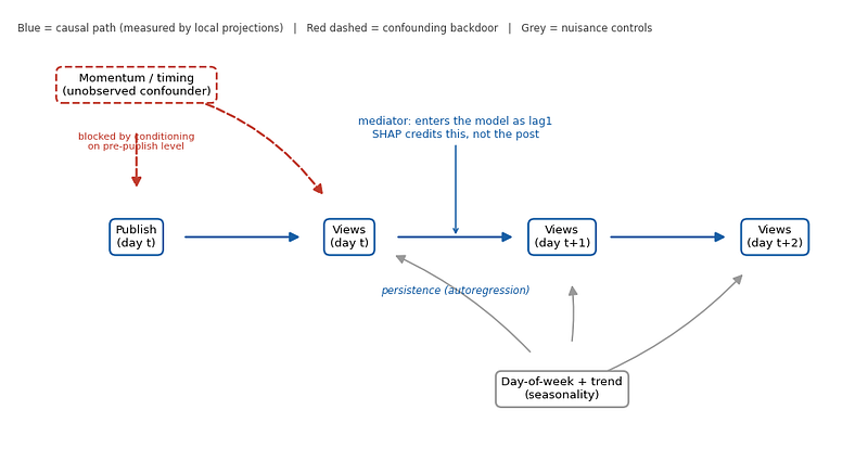
In the figure above, we have a visual representation of our situation. There may be unobserved confounders that result in more visits, like timing or momentum of the subject. Once an article is published, more visitors come during the days following its appearance. So there are also concepts of autoregression, trend and seasonality that come in.
So we must go back to data to decide on which approach to use to measure the true causal impact.
Letting the data reset my assumptions
There two things we must check before moving forward:
- Are my posts isolated enough to measure some decay?
- Is there a strong seasonality?
Both questions are easily answered with the code block below.
post_rows = df.index[df.published == 1].to_numpy()
gaps = pd.Series(post_rows).diff().dropna()
print(f"Posts: {df.published.sum()}   median gap: {gaps.median():.0f} days   "
      f">=3 clear days after: {(gaps >= 3).mean()*100:.0f}%")

print("\nMean views by day of week (0=Mon..6=Sun):")
print(df.groupby("dow")["y"].mean().round(0).to_string())

print("\nPosts by day of week (note the 0s -> no counterfactual for those days):")
print(df.groupby("dow")["published"].sum().to_string())
Which prints out:
Posts: 25   median gap: 28 days   >=3 clear days after: 96%

Mean views by day of week (0=Mon..6=Sun):
dow
0    1558.0
1    1572.0
2    1563.0
3    1500.0
4    1297.0
5     974.0
6    1099.0

Posts by day of week (note the 0s -> no counterfactual for those days):
dow
0    6
1    7
2    6
3    2
4    2
5    0
6    2
So, there are 25 posts with a median gap of 28 days between posts, and in 96% of the cases, there are at least 3 days separating each publication. That’s great!
Also, the seasonality is strong and evident. The mean visitors during weekdays is significantly higher than during the weekend.
Now, let’s strip out the effect of trend and seasonality to see the uplift from publishing an article. And I will also add a second correction to remove the mean of the 3 days preceding an article to compare both methods.
postset = set(post_rows)
window = {p + h for p in post_rows for h in range(-1, 8)}
quiet = df[~df.index.isin(window)]
base = smf.ols("y ~ C(dow) + t", quiet).fit()
resid = df["y"] - base.predict(df)

offsets = list(range(-5, 9))
def curve(per_event_base):
    rows = {h: [] for h in offsets}
    for p in post_rows:
        b = (np.mean([resid[p + k] for k in (-3, -2, -1) if 0 <= p + k < len(df)])
             if per_event_base else 0.0)
        for h in offsets:
            j = p + h
            if 0 <= j < len(df) and not (h != 0 and j in postset):
                rows[h].append(resid[j] - b)
    m  = {h: np.mean(v) for h, v in rows.items()}
    se = {h: np.std(v, ddof=1) / np.sqrt(len(v)) for h, v in rows.items()}
    return m, se

naive, _      = curve(per_event_base=False)
corr, corr_se = curve(per_event_base=True)

fig, ax = plt.subplots(figsize=(9.5, 5.2))
ax.axhline(0, color=C_GREY, ls="--", lw=1)
ax.axvspan(-0.4, 4.4, color=C_SHAP, alpha=0.10)
yA = [naive[h] for h in offsets]; yB = [corr[h] for h in offsets]
eB = [1.96 * corr_se[h] for h in offsets]
ax.plot(offsets, yA, "o--", color=C_FLAG, lw=1.8, ms=5, alpha=0.8,
        label="Naive: minus seasonal/trend baseline")
ax.fill_between(offsets, np.array(yB) - eB, np.array(yB) + eB, color=C_CAUSAL, alpha=0.20)
ax.plot(offsets, yB, "o-", color=C_CAUSAL, lw=2.2, ms=6,
        label="Corrected: also differenced vs own pre-period")
ax.set_xlabel("Days relative to publishing (0 = publication day)")
ax.set_ylabel("Views above baseline")
ax.set_xticks(offsets); ax.legend(frameon=False)
for s in ("top", "right"): ax.spines[s].set_visible(False)
plt.show()
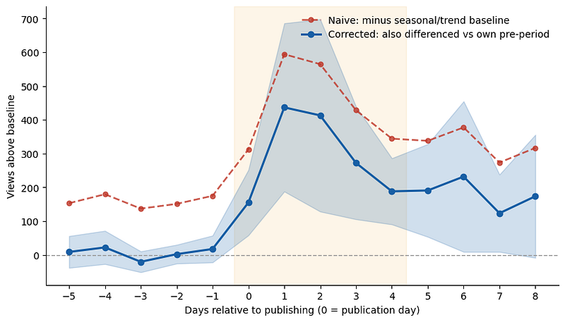
In the figure above, the orange line only removes the effect of trend and seasonality, while the blue curve also removes the mean of visitors in the 3-day period that precedes an article.
The fact that the orange line always sits above 0 before an article is released indicates that publishing an article is not the only element triggering new visitors! We are seeing the impact of confounders.
However, by removing the average of the 3-day period prior to publishing (blue curve), we now see values hovering around 0 in the preceding day. So this tells us that there is indeed a timing or momentum effect going on that also increases visitors, so we must correct it to get the actual causal impact of posting a new article.
Another interesting observation is that the visitors surge after an article does not decay in 2 days as I thought. In fact, it lingers for around five days. The blue band around the blue curve displays the 95% confidence interval. At days 6 through 8, we see that the band is really close the x-axis, meaning that it’s not significantly different from 0.
Now that we have a clearer understanding if the mechanism driving visitors to my blog, we will use local projections to measure the causal effect.
Local projections for impulse response
As we have seen in the previous section, publishing an article has a decaying effect over time. Thus, I must estimate the impulse response function (IRF). This is basically the trajectory my time series takes after an impulse, i.e. publishing a new article.
Traditionally, a vector autoregression (VAR) model is used, but local projections achieve the same objective in a simpler way.
Basically, we run multiple linear regressions for each horizon step. In this case, I will run it for 7 days after publishing for good measure. Below is the linear regression we run for each horizon step.
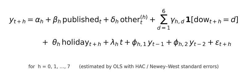
Let’s dissect each term in the equation above. We go in order of appearance and each term is separated by the addition symbol (+).
- The first term (alpha_h) is simply the intercept from the linear regression. It’s considered a “nuisance” parameter, and we should make it explicit to avoid falsifying our causal impact of publishing.
2. The second term (beta_h) is the causal effect of publishing at time t. By running multiple regressions, one for each horizon step, we accumulate this parameter and get our causal effect over the course of 7 days.
3. The term term accounts for any articles that were published shortly after another article. That way, we isolate the impact of a single article.
4. This summation term accounts for seasonality coming from the day of the weeks.
5. This term accounts for the holiday effects.
6. This term represents the linear trend of the series.
7. The next two terms (with parameters phi) designate the level prior to publishing. That removes the pedestal we saw when comparing the blue and orange curves earlier.
8. The last term is the error term. Note that even though we run separate regressions, the errors are really correlated, since we have overlapping horizons. Therefore, we fit the regression using the ordinary least square (OLS) method but with HAC (heteroskedasticity- and autocorrelation-consistent) standard errors.
All that is left to do is translate this logic to code.
d0 = df.copy()
d0["y_lag1"] = d0["y"].shift(1)
d0["y_lag2"] = d0["y"].shift(2)

lp = []
for h in range(0, 8):
    d = d0.copy()
    d["y_h"]   = d["y"].shift(-h)
    d["dow_h"] = d["dow"].shift(-h)
    d["hol_h"] = d["is_holiday"].shift(-h)
    # net out any other post landing between t+1 and t+h (avoids contamination)
    d["other"] = (sum((d["published"].shift(-k) for k in range(1, h + 1)),
                      start=pd.Series(0, index=d.index)) if h >= 1 else 0)
    d = d.dropna(subset=["y_h", "y_lag1", "y_lag2", "dow_h"])

    m = smf.ols("y_h ~ published + other + C(dow_h) + hol_h + t + y_lag1 + y_lag2", d) \
           .fit(cov_type="HAC", cov_kwds={"maxlags": max(h, 1)})   # HAC: autocorrelation-robust
    lo, hi = m.conf_int().loc["published"]
    lp.append((h, m.params["published"], lo, hi, m.pvalues["published"]))

causal_by_h = {h: b for h, b, *_ in lp}
print("h    effect     95% CI              p")
for h, b, lo, hi, p in lp:
    print(f"+{h}   {b:7.0f}   [{lo:6.0f}, {hi:6.0f}]   {p:.3f}")
for c in (2, 4, 7):
    print(f"cumulative through day +{c}: {sum(r[1] for r in lp[:c+1]):.0f} views")
The code block above prints:
h    effect     95% CI              p
+0       151   [    52,    250]   0.003
+1       452   [   209,    695]   0.000
+2       416   [   151,    681]   0.002
+3       292   [   133,    450]   0.000
+4       218   [   121,    315]   0.000
+5       199   [    72,    326]   0.002
+6       204   [     7,    401]   0.042
+7       116   [     5,    226]   0.040
cumulative through day +2: 1020 views
cumulative through day +4: 1530 views
cumulative through day +7: 2048 views
Thus, we can say a new blog post is worth about 1500 extra visitors over 5 days, with peaks happening on the first and second day after publishing.
We can also visualize the effect below.
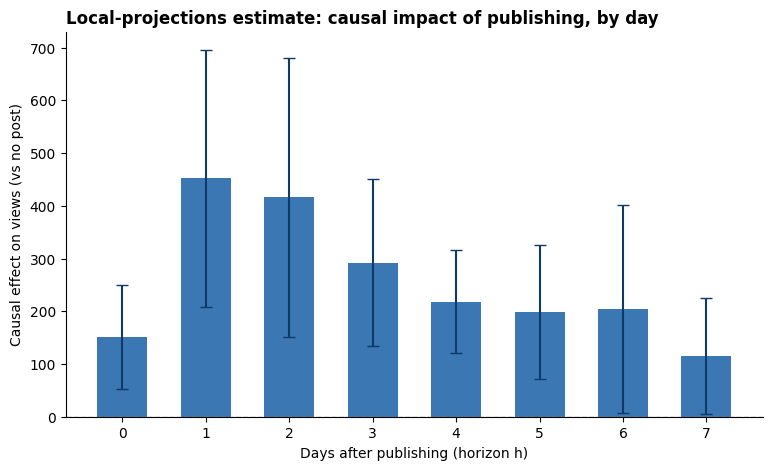
Notice in the figure above that the confidence intervals become very wide on days 6 and 7, almost touching 0.
As such, we can say that publishing an article really has an impact during 5 days, and the effect is hard to distinguish from noise afterwards.
Now, we have found the answer to our question! But let’s go back to Shapley values for a moment. Can we make them get the right answer?
Going back to Shapley values
The short answer is: yes. We can manipulate the modeling portion to get very similar causal estimates using Shapley values.
Remember that the issue with Shapley values was that it was crediting lag1. In other words, it was saying:
Today’s traffic is high because yesterday’s traffic was high.
Yet, the reason traffic was high is probably because an article was published.
What is happening is that SHAP is crediting a mediator. A mediator is an intermediate variable that sits between the cause and the effect.
In this case, what happens is that I publish an article today, traffic increases, and the model sees that as a really good indicator that traffic will be high tomorrow too. But it’s not crediting the original “I published an article” action.
To solve that, we need to pass to the model only information about the treatment. In other words, the model never sees past lags of the series.
dfB = mlf_df.copy()
for L in range(1, 6):
    dfB[f"pub_lag{L}"] = dfB["published"].shift(L).fillna(0)

fcstB = MLForecast(
    models={"lgb": lgb.LGBMRegressor(n_estimators=400, learning_rate=0.03,
                                     num_leaves=31, verbose=-1)},
    freq="D", lags=[], date_features=["dayofweek"],     # No target lags
)
prepB = fcstB.preprocess(dfB, static_features=[])
fcstB.fit(dfB, static_features=[])
colsB = [c for c in prepB.columns if c not in ("unique_id", "ds", "y")]
svB = pd.DataFrame(shap.TreeExplainer(fcstB.models_["lgb"]).shap_values(prepB[colsB]),
                   columns=colsB, index=prepB.index)

pub_family = ["published"] + [f"pub_lag{L}" for L in range(1, 6)]
post_pos = prepB.index[prepB["published"] == 1].to_numpy()
shapB_by_h = []
print("day   SHAP credit   (causal)")
for k, feat in enumerate(pub_family):
    rows = [p + k for p in post_pos if (p + k) in prepB.index]
    val = svB.loc[rows, feat].mean(); shapB_by_h.append(val)
    print(f"+{k}     {val:6.0f}       (~{causal_by_h[k]:.0f})")
The code block above fits the same LightGBM model, but this time we only pass information about how long ago an article was published. We don’t use past lags in this case.
The code block above then prints out:
day   SHAP credit   (causal)
+0        158       (~151)
+1        434       (~452)
+2        428       (~416)
+3        306       (~292)
+4        242       (~218)
+5        222       (~199)
As you can see, we now get SHAP values that are very close to our estimate using local projections. However, we had to provide the answer to the model by manually encoding information about the treatment.
Conclusion
In this article, we answered the causal question of how many extra visitors come to my blog when I publish a new article. A deceptively simple question, but we encountered a few hurdles.
First off, SHAP values are not able to answer these questions directly, so we learned that feature attribution is not the same as causation.
We built a causal diagram to help us understand the mechanism in play and learned that we needed to model an impulse response function.
To do so, we used local projections which stack many linear regressions over a certain horizon. This led us to measure that a new article is worth about 1500 visitors in the first 5 days of publishing. Afterwards, the impact dies out.
Finally, we learned that SHAP was wrong because it was crediting a mediator variable. By removing information from past lags and passing only information about the treatment, we were able to recover the causal estimates using SHAP. However, this was only possible because we understood the underlying mechanism and we had causal estimates in hand.
I hope you found this article useful and that it makes you curious to learn more about causality with time series data.
Thank you for reading.
Learn the latest time series analysis techniques with my 👉 free time series cheat sheet 👈 in Python! Get the implementation of statistical and deep learning techniques, all in Python and TensorFlow!
Cheers 🍻
Next steps
If you are looking to level up your forecasting skills, check out some of my courses:
- Applied Time Series Forecasting in Python — the shortcut mastering time series forecasting where I teach everything I learned about forecasting, from statistical models to machine learning and deep learning models.
- Foundation Models for Time Series — take TimeGPT, Chronos, TimesFM and more, and apply them for zero-shot forecasting, fine-tune them, and incorporate exogenous features for state-of-the-art results.
References
- Ò. Jordà, “Estimation and Inference of Impulse Responses by Local Projections,” American Economic Review, vol. 95, no. 1, pp. 161–182, Feb. 2005, doi: 10.1257/0002828053828518.
Stay connected with news and updates!
Join the mailing list to receive the latest articles, course announcements, and VIP invitations!
Don't worry, your information will not be shared.
I don't have the time to spam you and I'll never sell your information to anyone.
