Forecasting Intermittent Time Series in Python
Aug 02, 2023
Intermittent time series, or sparse time series, is a special case where non-zero values appear sporadically in time, while the rest of the values are 0.
A common example of spare time series is rainfall over time. There can be a lot of consecutive days without rain, and when it rains, the volume varies.
Another real-life example of intermittent series is in the demand of slow-moving or high-value items, such as spare parts in aerospace or heavy machinery.
The intermittent nature of some time series pose a real challenge in forecasting, as traditional model do not handle intermittency well. Therefore, we must turn to alternate forecasting methods tailored for sparse time series.
In this article, we explore different ways of forecasting intermittent time series. As always, we explore each model theoretically first, and implement them in Python.
As always, the full source code is available on GitHub.
Learn the latest time series analysis techniques with my free time series cheat sheet in Python! Get the implementation of statistical and deep learning techniques, all in Python and TensorFlow!
Let’s get started!
Croston’s method
Croston’s method is one of the most common approaches to forecasting spare time series. It often acts as a baseline model to evaluate more complex methods.
With Croston’s method, two series are constructed from the original series:
- A series containing the time periods with only zero values
- A series containing time periods with non-zero values
Let’s consider a toy example to illustrate that. Given the spare time series below:

Then, according to Croston’s method, we create two new series: one with non-zero values, and the other with the period of time separating non-zero values.
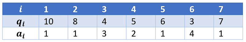
From the table above, we can see that the we denote non-zero values as qᵢ and the period between two consecutive non-zero values as aᵢ.
Note also that the first value of aᵢ is 1, because we have a non-zero value at t=1. Also, the period between two consecutive values is also considered to be 1.
From there, we predict each series using simple exponential smoothing according to the equations below:
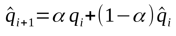
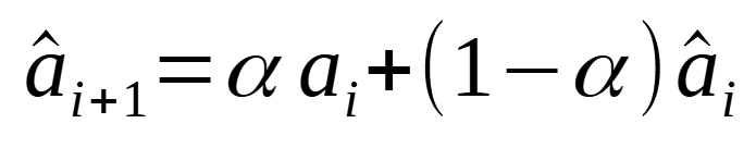
Of course, the smoothing parameter alpha is between 0 and 1, as we are using simple exponential smoothing. Note also that the same smoothing parameter is used for both equations.
Then, the final forecast is the ratio of q and a, as shown in the equation below:
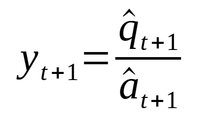
Now, since simple exponential smoothing is used to forecast each series, the prediction will be a flat horizontal line. That is why we often use it as a baseline model.
Also, most implementations of the basic Croston’s method use a value of 0.1 for the smoothing parameter.
Again, this is the most basic method for forecasting intermittent time series, but there are ways to easily improve it, as we discuss next.
Improving the Croston’s method
As we have seen earlier, the classical Croston’s method uses the same smoothing parameter of 0.1 to forecast both constructed series, which does not seem to be ideal.
An optimized version of Croston’s method was suggested, where the smoothing parameter is varied between 0.1 and 0.3. Also, each series is optimized separately.
Everything remains unchanged, but now, we have unique optimized smoothing parameters for each series that make up the final forecast.
Croston’s method in action
Let’s implement Croston’s method on a simulated dataset to see the kind of predictions we can make with this model.
First, I will import the required libraries and read the data.
import pandas as pd
import numpy as np
import matplotlib.pyplot as plt

sim_df = pd.read_csv('intermittent_time_series.csv')
Then, we use the implementation available in statsforecast. For now, let’s work with the classical version of Croston’s method which uses a smoothing factor of 0.1.
from statsforecast import StatsForecast
from statsforecast.models import CrostonClassic

models = [CrostonClassic()]

sf = StatsForecast(
    df=sim_df,
    models=models,
    freq='H',
    n_jobs=-1
)
Then, to compare the model’s predictions to the actual data in our simulated dataset, we run the cross-validation function. Here, we set the horizon to 1, so that our prediction curve is updated at every time step, over the last 50 time steps of our dataset.
cv_df = sf.cross_validation(
    df=sim_df,
    h=1,
    step_size=1,
    n_windows=50
)
Then, we can plot the actual values and the predictions coming from the model.
fig, ax = plt.subplots(figsize=(10,8))

ax.bar(sim_df.index, sim_df['y'], color='lightgray')
ax.plot(cv_df.index, cv_df['CrostonClassic'], ls='--', label='Croston')
ax.set_ylabel('Value')
ax.set_xlabel('Time steps')
ax.legend(loc='best')
plt.xlim(40, 100)

plt.tight_layout()
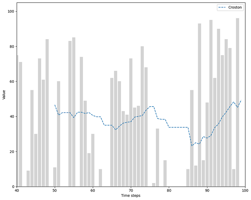
From the figure above, we can see how, intuitively, Croston’s method is really a weighted average for intermittent time series.
Looking closely, if a past value was large, then the next prediction would increase, and if a past value was small, then the next prediction would decrease.
Notice also the period of time where we have consecutive zero values, meaning that the prediction curve does not get updated, and remains flat.
Finally, keep in mind that our prediction curve moves a lot because we forecast only the next time step. If we set a longer horizon, the curve resemble more of a staircase, since Croston’s method outputs a constant value.
Optimized Croston’s method in action
Now, let’s repeat the same exercise as above, but using the optimized version of Croston’s method, where the smoothing parameter is optimized separately for the non-zero values series, and the zero values series.
from statsforecast.models import CrostonOptimized

models = [CrostonOptimized()]

sf = StatsForecast(
    df=sim_df,
    models=models,
    freq='H',
    n_jobs=-1
)

cv_df = sf.cross_validation(
    df=sim_df,
    h=1,
    step_size=1,
    n_windows=50
)

cv_df.index = np.arange(50, 100, 1)
Plotting the results gives the following figure.
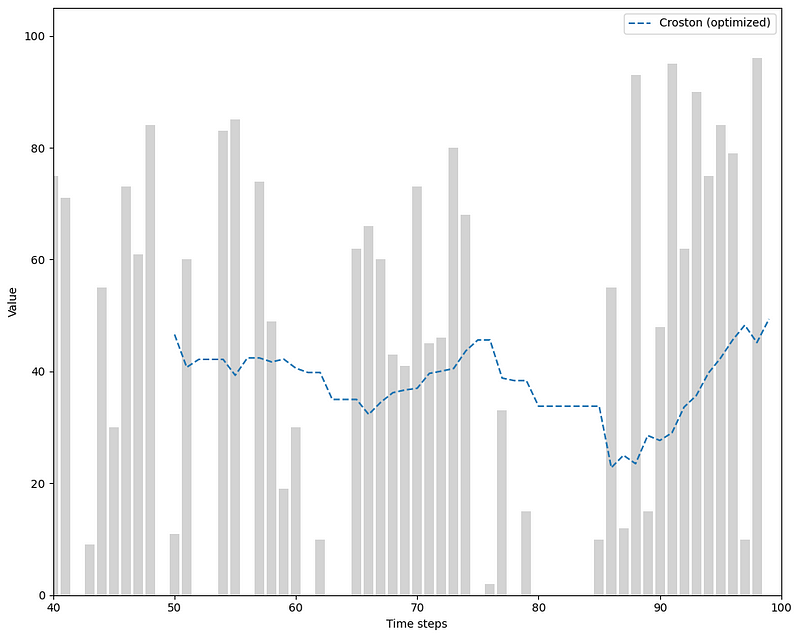
Looking at the figure, we can see how optimizing smoothing parameter resulted in essentially the same predictions as the classical method for our simulated data.
Now that we understand Croston’s method, let’s move on to another forecasting technique.
Aggregate-Disaggreagate Intermittent Demand Approach (ADIDA)
The Aggregate-Disaggregate Intermittent Demand Approach, or ADIDA, aims to remove intermittence by aggregating the series at a lower frequency.
For example, if hourly data has zero values, then summing over 24 hours to get daily data might get rid of the zero values. The same logic applies to intermittent daily data that we could aggregate to weekly data to remove periods with zero values.
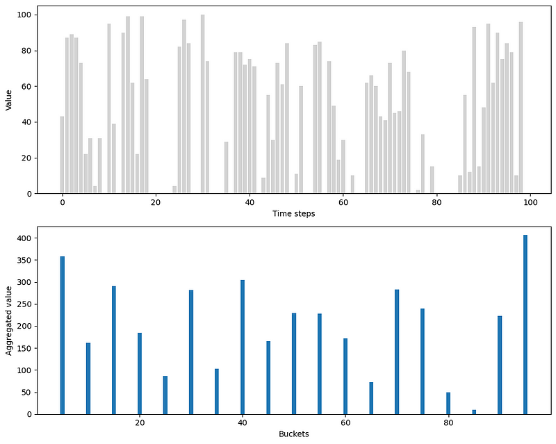
In the figure above, we can see the effect of aggregation on our simulated data. Here, we aggregate over five time steps. The resulting aggregated series, shown in the bottom plot, is not intermittent anymore, since we got rid of all zero values.
Once the data is aggregated, simple exponential smoothing is again used to forecast the aggregated series.
Then, we disaggregate the predictions to bring them back to the original frequency. For example, if hourly data was aggregated to daily data, then each prediction would be divided by 24 (since there are 24 hours in a day) to get the disaggregated predictions.
How to choose the aggregation level
Of course, the aggregation level greatly impacts the predictions and performance of the model.
If the aggregation is too big, for example going from hourly to weekly data, then you might lose a lot of information.
If the aggregation is too small, then the resulting series might also be intermittent, in which case traditional forecasting methods will not work appropriately.
While there is no clear answer on how to choose the aggregation level, one way that is implemented in statsforecast is to calculate the the length of all intervals between non-zero values, and take the average of the intervals as the aggregate level.
For example, if your intermittent series has intervals between non-zero values of [3, 5, 4], then the aggregate level would be 4.
In the best case scenario, this method completely removes the intermittency. Otherwise, only a few zero values will remain, which should not greatly impact exponential smoothing.
ADIDA in action
Now, let’s implement ADIDA on our simulated data and see the predictions we obtain.
Using statsforecast, the implementation remains straightforward, as we simply need to change the model, but the pipeline stays the same.
from statsforecast.models import ADIDA

models = [CrostonOptimized(), ADIDA()]

sf = StatsForecast(
    df=sim_df,
    models=models,
    freq='H',
    n_jobs=-1
)

cv_df = sf.cross_validation(
    df=sim_df,
    h=1,
    step_size=1,
    n_windows=50
)

cv_df.index = np.arange(50, 100, 1)
We then plot the predictions and see how it behaves when compared to Croston’s method.
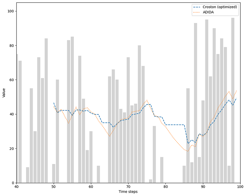
In the figure above, we can see that ADIDA reacts much more to periods with zero values. While the predictions from Croston will remain constant if zero values are observed, ADIDA will gradually decrease the prediction curve, and so it approaches more the actual data.
While ADIDA considers a single aggregation level, an iteration to the model was proposed to consider multiple aggregation levels. This is what we study in the next section.
Intermittent Multiple Aggregation Prediction Algorithm (IMAPA)
As mentioned earlier, ADIDA only considers one aggregation level.
However, it is possible that information can be retrieved from a series at different aggregation levels.
For example, given hourly data, different patterns will arise if we aggregate the data daily, weekly, or monthly.
This is the general idea behind the Intermittent Multiple Aggregation Prediction Algorithm or IMAPA.
Again, the data is aggregated, but at multiple levels. Then, just like with ADIDA, simple exponential smoothing is used to generate predictions at each aggregation level. After, each prediction is dissagregated, just like in ADIDA.
The final prediction is then obtained by taking the average of each predictions at each aggregation level.
Thus, we can think of IMAPA as running ADIDA multiple times at different aggregation levels, and then simply averaging the predictions to get a final prediction.
With all that in mind, let’s see how IMAPA behaves on our simulated data.
IMAPA in action
Still using statsforecast, we simply add the IMAPA algorithm to our pipeline.
from statsforecast.models import IMAPA

models = [ADIDA(), IMAPA()]

sf = StatsForecast(
    df=sim_df,
    models=models,
    freq='H',
    n_jobs=-1
)

cv_df = sf.cross_validation(
    df=sim_df,
    h=1,
    step_size=1,
    n_windows=50
)

cv_df.index = np.arange(50, 100, 1)
Then, we can plot the predictions.
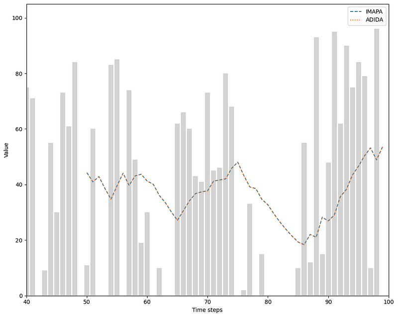
Looking at the figure above, we notice that both curves are overlapping, meaning that IMAPA and ADIDA give the same forecasts, in this case.
While this is underwhelming, keep in mind that we are using simulated data and we will work on a real-life dataset soon.
Before that, we have one last method to explore.
Teunter-Syntetos-Babai model (TSB)
The Teunter-Syntetos-Babais model, or TSB, proposes an improvement over Croston’s method.
As we have seen earlier, predictions from Croston’s method stay constant during period with zero values. This means that the predictions can become outdated with many periods of zero values.
In other words, Croston’s method ignores the risk of obsolescence, which occurs when non-zero values are separated by longer and longer zero demand periods.
This is especially important in inventory management of low-demand products, as companies can hold stocks of unused inventory for many years, which comes at a cost. They must therefore assess the risk of obsolescence to determine if they can get rid of dead stock or not.
This is where the TSB model comes in. Instead of considering the demand interval, which are the periods of zero values, it will consider the demand probability, defined as:
While this seems to be a small difference, it can actually have a big impact. With Croston’s method, the demand interval can only be updated once we observe a non-zero value.
On the other hand, the demand probability is updated at every time step, making the model more flexible.
To make a prediction, the model also creates two series from the original series:
- One containing only non-zero values (also called demand)
- The other is for the demand probability
Predictions for each series is done using simple exponential smoothing. Then, the final prediction is obtained by multiplying the demand by the demand probability.
With all that in mind, let’s apply the TSB model to our simulated data.
TSB in action
Unlike the optimized version of Croston’s method, the implementation of TSB in statsforecast needs us to specify the smoothing parameter for each series.
This means that we have to manually optimize those parameters. For now, let’s just use 0.1 for both parameters, just to see how the model behaves on our simulated data.
from statsforecast.models import TSB

models = [TSB(0.1, 0.1), CrostonClassic()]

sf = StatsForecast(
    df=sim_df,
    models=models,
    freq='H',
    n_jobs=-1
)

cv_df = sf.cross_validation(
    df=sim_df,
    h=1,
    step_size=1,
    n_windows=50
)

cv_df.index = np.arange(50, 100, 1)
Then, we can plot the predictions.
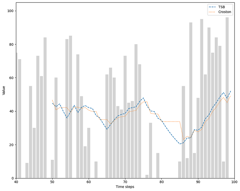
Looking at the figure above, we can see how using the demand probability makes a big difference, as the predictions are decreasing during no-demand periods, instead of being constant.
Now that we have covered many forecasting models for intermittent time series, let’s apply our knowledge in a little capstone project.
Capstone project — Predict the power output of wind turbines
Wind turbines are a source of renewable energy, but are unfortunately unreliable, due to the unpredictable nature of wind.
Sometimes, the power output can be very large, and other times, it can be very small.
There can also be days where the wind is too strong, so the wind turbine shuts down and no power is generated. Also, there may be not enough wind, which also results in no power being produced.
Hence, we can see how the power output of a wind turbine is an intermittent time series.
As a reminder, you can look at the full source code of this project on GitHub.
Data preparation
We start by reading our data and formatting it such that we can use statsforecast. We drop unecessary columns and format the time as a timestamp. Finally, we create a unique_id column and rename the columns appropriately.
df = pd.read_csv('TexasTurbine.csv')

df = df.drop(['Wind speed | (m/s)', 'Wind direction | (deg)', 'Pressure | (atm)', "Air temperature | ('C)"], axis=1)

start_date = pd.to_datetime('2023-01-01 00:00:00')
end_date = pd.to_datetime('2023-12-31 23:00:00')
date_range = pd.date_range(start=start_date, end=end_date, freq='H')

df['ds'] = date_range

df = df.rename(columns={'System power generated | (kW)': "y"})

df = df.drop(['Time stamp'], axis=1)

df['unique_id'] = 1
df = df[['unique_id', 'ds', 'y']]
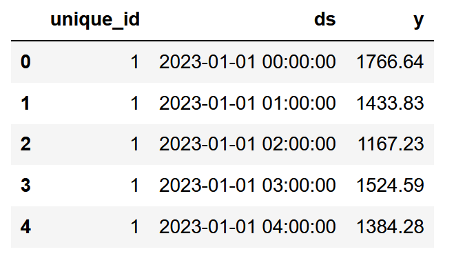
Like that, we have our data formatted the way statsforecast expects it. Remember that the unique_id column is to identify different time series within the same dataset. In our case, we only have one series, so the unique_id is constant for all rows.
Then, we can visualize our data. Here, we focus only on the first 200 time steps, as we have a fairly large dataset.
fig, ax = plt.subplots( figsize=(10,8))

ax.bar(df.index, df['y'], color='grey', width=0.1)
ax.set_ylabel('Wind power (kW)')
ax.set_xlabel('Time steps')

plt.xlim(0, 200)
plt.tight_layout()
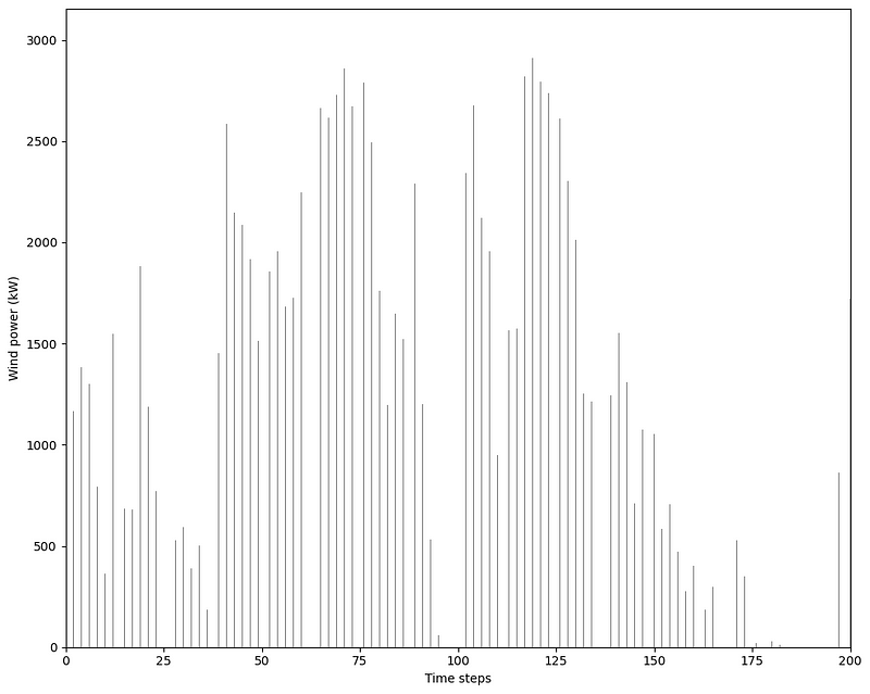
From the figure above, we can see the intermittent nature of our data. We definitely notice periods of zero values, and notice also very large swings between high power output and low power output.
Now, let’s try to forecast the power output of the wind turbine. We will consider three different forecast horizons:
- one hour
- one day
- one week
For each horizon, we will use the mean absolute error (MAE) to evaluate the performance of each model and select the best one. Our baseline model will be simple exponential smoothing.
Forecast the next hour
To test different models, we simply list them out in a Python list.
Here, we immediately used the optimized implementation of Croston’s method to have the optimal values for the smoothing parameters.
from statsforecast.models import SimpleExponentialSmoothingOptimized as SESOpt

models = [CrostonOptimized(), ADIDA(), IMAPA(), TSB(0.2, 0.2), SESOpt()]
Once this is done, we can initialize the Statsforecast object to pass in our dataset, and specify the frequency of our data.
sf = StatsForecast(
    df=df,
    models=models,
    freq='H',
    n_jobs=-1 # use all computing power available
)
Then, we run cross-validation to compare the predicted values against known values. Since we are forecasting the next hour, we set our horizon to 1. Also, we evaluate our models over 50 predictions.
h_cv_df = sf.cross_validation(
    df=df,
    h=1, # Horizon is 1, since we forecast the next hour
    step_size=1, # Move the window by 1 time step
    n_windows=50 # Make 50 windows of cross-validation
)

h_cv_df.index = np.arange(8709, 8759, 1)
This results in a DataFrame with predictions from each model and the actual values. This allows us to plot the predicted values against the real values.
fig, ax = plt.subplots( figsize=(10,8))

ax.bar(h_cv_df.index, h_cv_df['y'], color='lightgrey')
ax.plot(h_cv_df.index, h_cv_df['CrostonOptimized'], ls='--', label='Croston')
ax.plot(h_cv_df.index, h_cv_df['ADIDA'], ls=':', label='ADIDA')
ax.plot(h_cv_df.index, h_cv_df['TSB'], ls='-.', label='TSB')
ax.plot(h_cv_df.index, h_cv_df['SESOpt'], ls=':', label='SES')

ax.set_ylabel('Wind power (kW)')
ax.set_xlabel('Time steps')

ax.legend(loc='best')

plt.tight_layout()
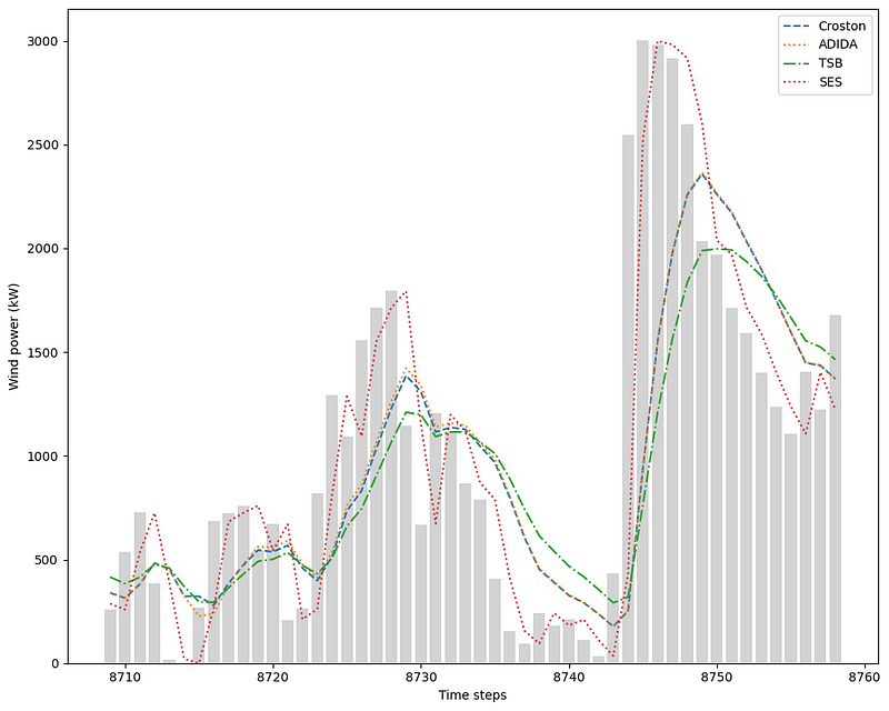
From the figure above, we notice two things.
First, I did not plot the curve from IMAPA, as it gave the exact same forecast as ADIDA.
Second, simple exponential smoothing seems to be doing a really good job at forecasting the next time step, since its curve is much closer to the actual values than the other models.
To verify that, let’s calculate the MAE for each model and create a bar plot to identify the best model.
from sklearn.metrics import mean_absolute_error

mae_croston_h = mean_absolute_error(h_cv_df['y'], h_cv_df['CrostonOptimized'])
mae_adida_h = mean_absolute_error(h_cv_df['y'], h_cv_df['ADIDA'])
mae_tsb_h = mean_absolute_error(h_cv_df['y'], h_cv_df['TSB'])
mae_ses_h = mean_absolute_error(h_cv_df['y'], h_cv_df['SESOpt'])

y = [mae_croston_h, mae_adida_h, mae_tsb_h, mae_ses_h]
x = ['Croston', 'ADIDA', 'TSB', 'SES']

fig, ax = plt.subplots()

ax.bar(x, y, width=0.4)
ax.set_xlabel('Models')
ax.set_ylabel('MAE (kW)')
ax.set_xlabel('Models')
ax.set_ylim(0, 500)

for index, value in enumerate(y):
    plt.text(x=index, y=value + 5, s=str(round(value,2)), ha='center')

plt.tight_layout()
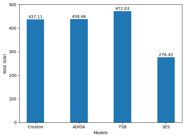
With no surprise, simple exponential smoothing is the best model as it achieves the lowest MAE. In this situation, it seems that our baseline performs best for forecasting the next time step.
Let’s see how the models behave for forecasting the next day.
Forecast the next day
To forecast the next day, the Statforecast object stays the same.
Now, we simply set the horizon to 24 hours and shift the cross-validation window by 24 time steps. Here, we do five rounds of cross-validation.
d_cv_df = sf.cross_validation(
    df=df,
    h=24,
    step_size=24,
    n_windows=5
)

d_cv_df.index = np.arange(8639, 8759, 1)
Then, we can plot the predictions and the actual values.
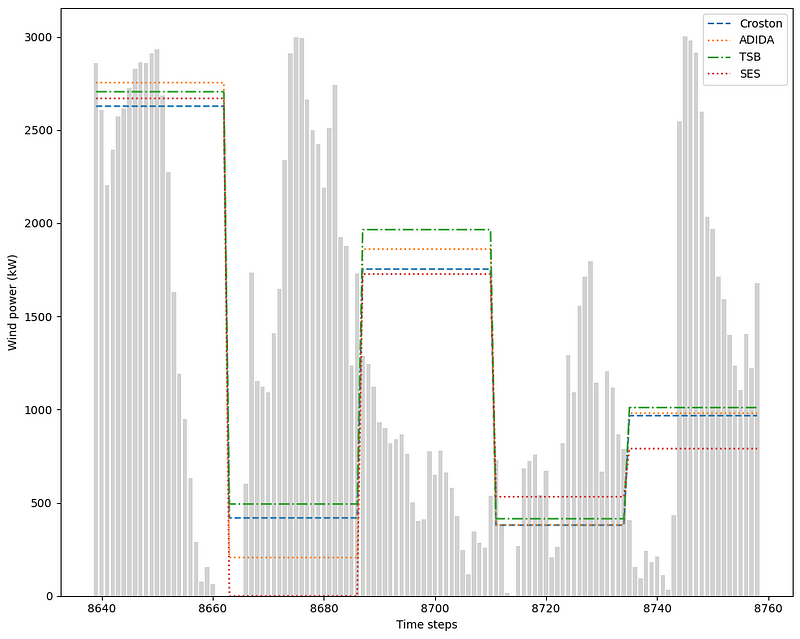
In the figure above, we notice how our predictions are flat over the horizon, which is normal since each model outputs a constant value.
We can also see that the performance of simple exponential smoothing quickly degraded when forecasting on a longer horizon. Clearly, periods with zero values are not handled well by simple exponential smoothing.
Evaluating each model using the MAE gives the following result.
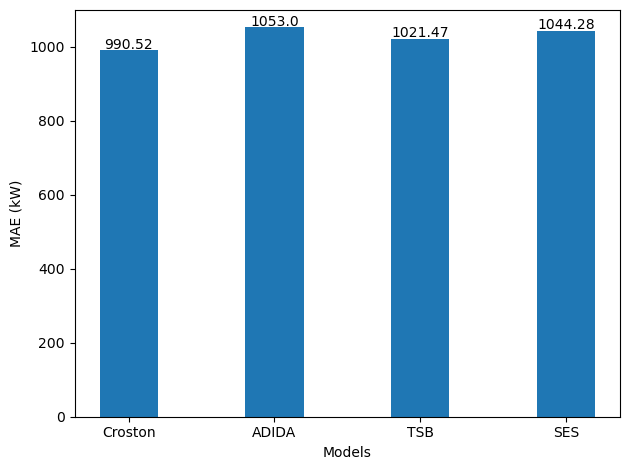
From the figure above, we see that the optimized Croston’s method is the best performing model, achieving the lowest MAE. We also that simple exponential smoothing, when forecasting on a longer horizon, performs worse than Croston and TSB.
Also, keep in mind that since we increased our forecast horizon, the errors also increase, which is to be expected. The further we forecast into the future, the more likely we will be far from the actual values.
Finally, let’s set the horizon for a week.
Forecast the next week
To forecast the next week, we set our horizon to 168 time steps, since there are 168 hours in a week, and we have hourly data
w_cv_df = sf.cross_validation(
    df=df,
    h=168,
    step_size=168,
    n_windows=2
)

w_cv_df.index = np.arange(8423, 8759, 1)
Again, we can plot the predictions of each model.
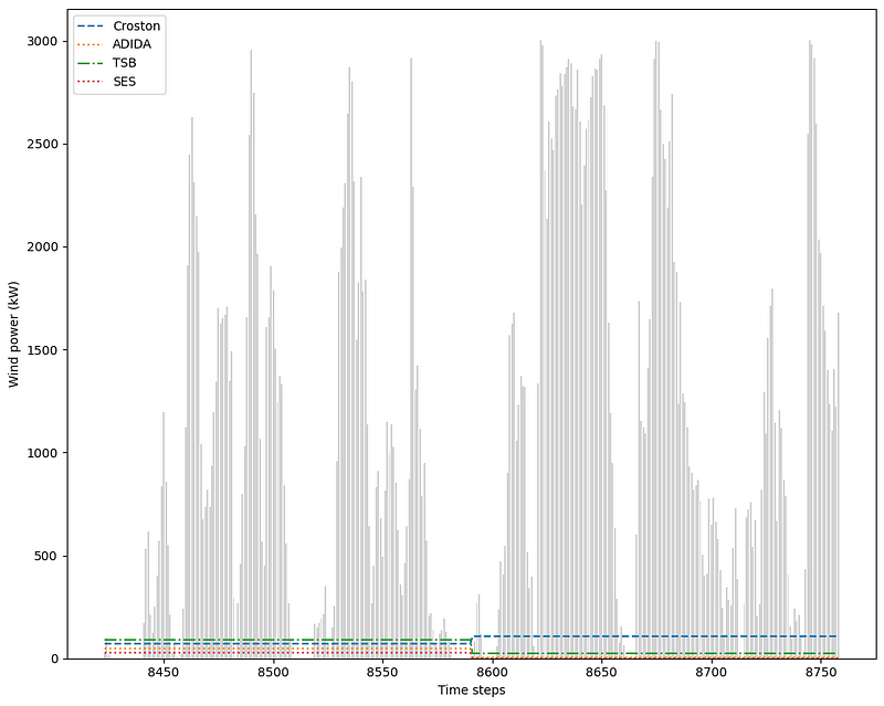
The figure above is a bit underwhelming, as we can clearly see that are models are very far from the actual values. This is to be expected since our horizon is fairly long.
Evaluating our models gives the following result.
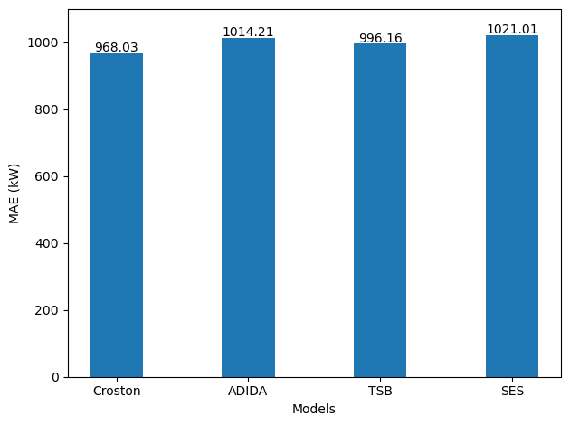
From the figure above, we again see that Croston’s method is the best model as it achieves the lowest MAE.
Interestingly, we also notice that the MAE did not increase significantly compared to forecasting the next day, even though the horizon is the seven times longer.
Still, in practice, I doubt that forecasting a constant value over a week is really going to help make a decision or plan for the future.
Conclusion
We have seen how intermittent time series pose an interesting forecasting challenge, as traditional models do not handle periods of zero values very well.
We explored different forecasting models, like Croston’s method, ADIDA, IMAPA and TSB, each bringing a new approach to predicting sparse time series.
Congratulations on making it to the end and thank you so much for reading! I hope that you enjoyed and that your learned something new!
If you are looking to master time series forecasting? The check out Applied Time Series Forecasting in Python. This is the only course that uses Python to implement statistical, deep learning and state-of-the-art models in 15 guided hands-on projects.
Cheers 🍻
Support me
Enjoying my work? Show your support with Buy me a coffee, a simple way for you to encourage me, and I get to enjoy a cup of coffee! If you feel like it, just click the button below 👇

Stay connected with news and updates!
Join the mailing list to receive the latest articles, course announcements, and VIP invitations!
Don't worry, your information will not be shared.
I don't have the time to spam you and I'll never sell your information to anyone.
